Overview
How to use Buttons & Quick Replies in BFML.
In this guide, you’ll learn everything there is to know about buttons and quick replies, their uses, and how to use them effectively in your app.
Buttons vs Quick Replies
First, let’s review what buttons and quick replies are.
Quick replies make interacting with your app easier for the user by suggesting pre-written phrases the app is able to understand and that make sense in the current context. They are written from the perspective of the user.
Examples:
- I need to reset my password
- I haven’t received my order
- I can’t login to my account
Buttons are UI elements. As a result, they typically contain few words (think commands, not phrases). Suggested reading: imperative mood.
Examples:
- Create account
- Contact support
- Cancel order
On the Meya platform, both quick replies and buttons offer the same functionality. However, how they’re used in conversational design is where they differ. The UI is different, which informs how the user thinks, acts and interacts with the element.
Buttons are typically tied to a card or tile. Quick replies are typically in response to a question or provide out-of-band options to jump tracks in a conversation. They also differ technically but where a quick reply can be configured to reply as a text.say event instead of a button.click event, whereas buttons can only create button.click events.
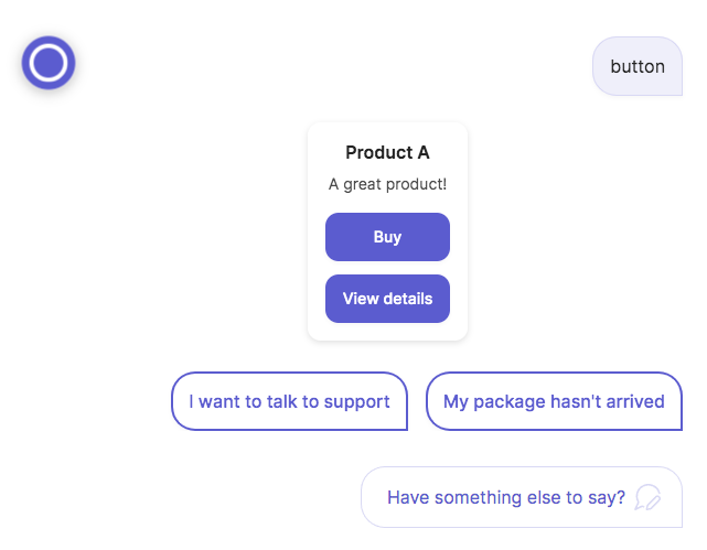
Here’slies apphow buttons and quick repear in the Meya Orb Web SDK
integration:
Compatibility
Buttons and quick replies are not available on all components. View the links below to learn which components support buttons and quick replies, and what button fields are compatible with other button fields.
Types
There are six types of buttons and quick replies: url, action, flow_next, component_next, static, and text. The Meya platform infers the type of the button by evaluating which properties have been set. For example, if the url property is specified, it will be assigned the url button type.
Field compatibility
The order the button types are listed in the table below is also the order of precedence during type evaluation, meaning if the url and result fields are both set, the url field takes precedence and the button will be inferred as a url button.
Button type | Inferred when... | Compatible | Incompatible |
|---|---|---|---|
| the |
|
|
| the action property is set. |
|
|
| the result or data properties are set. |
|
|
| the javascript or button_id properties are set. |
|
|
| none of the above types are inferred. |
|
|
Component support
Quick reply support
Any component that inherits from the InteractiveComponent Python class supports quick replies. The table below shows components that currently meet this criteria.
Component | Documentation |
|---|---|
| |
| |
| |
| |
| |
| |
| |
| |
| |
| |
| |
| |
| |
| |
| |
| |
| |
| |
| |
| |
|
Each of these components has a quick_replies property that accepts a list of quick replies. Quick reply properties are described in the Button and quick reply properties section below.
Button support
The button.ask component has a buttons property that accepts a list of buttons.
The tile.ask component has a tiles property, which is a list of tile definitions. Each tile has a buttons property that accepts a list of buttons.
Button spec
Buttons and quick replies share the same set of fields called a button spec that specifies how the button should look and work. This button spec maps to the [ButtonElementSpec] (https://github.com/meya-customers/meya-sdk/blob/main/meya/button/spec.py) Python class that gets used in the InteractiveComponent class and other component classes that support buttons.
This section describes each of the fields in detail and offers some examples of how they can be used.
url field
url fieldThe url field lets the user open a webpage in a new tab or mobile web view, when they click the button.
In this example, we’ll create a url button that opens the Google search page in a new tab.
triggers:
  - keyword: test

steps:
  - tiles:
      - title: A URL button
        buttons:
          - url: https://www.google.com
            text: Google
  - say: Done!
Which produces the following in the Meya Orb Web SDK client:
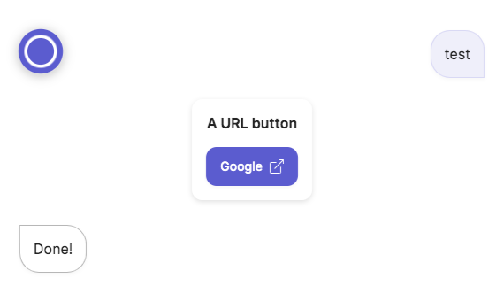
Since url buttons do not generate dynamic triggers, the flow continued on to the next step without waiting for the user to click the button.
The presence of theurlproperty will cause the button’s inferred type to beurl. Not all fields are compatible with theurlbutton type. Refer to the compatibility section above for more detail.
javascript field
javascript fieldA button can execute Javascript using the javascript property. This is a very powerful feature that opens up the possibility of interacting with the webpage the app is running on.
Examples:
- A button that updates a map on your webpage to show stores near the user.
- A button that fills out a form on your webpage with information it already knows about the user.
Note, this is only compatible with the Meya Orb Web SDK and not with the Meya Orb Mobile SDK.
In this example, we’ll create a button that runs a simple Javascript function to print a message to the browser’s console.
- Create this flow in your app:
triggers:
  - keyword: test

steps:
  - tiles:
      - title: A Javascript button
        buttons:
          - text: Run some Javascript
            javascript: test()
            action: next
- say: Done!-
Make sure you've added the Meya Orb Web SDK integration to your app.
-
In your browser, go to your app’s console, click the Integrations tab and open the Meya Orb integration. Copy the HTML snippet and paste it into a new Codepen.
-
Add a new Javascript function to your Codepen:
function test() {
    console.log("This is a test");
}
Test the button’s Javascript by typing the word test:
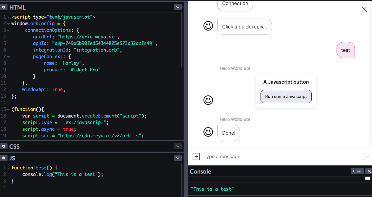
You should see the phrase This is a test appear in the console.
The presence of thejavascriptproperty will cause the button’s inferred type to be static. Not all fields are compatible with the static button type. Refer to the compatibility section above for more detail.
icon field
icon fieldThe icon property can be used to display an icon inside the button or quick reply. Icons can be used instead of, or in addition to, text.
You can use any icons found any icon found in the Light, Regular or Bold collection found in Streamline icons here. Check the Icons guide for more info on using icons.
Example 1
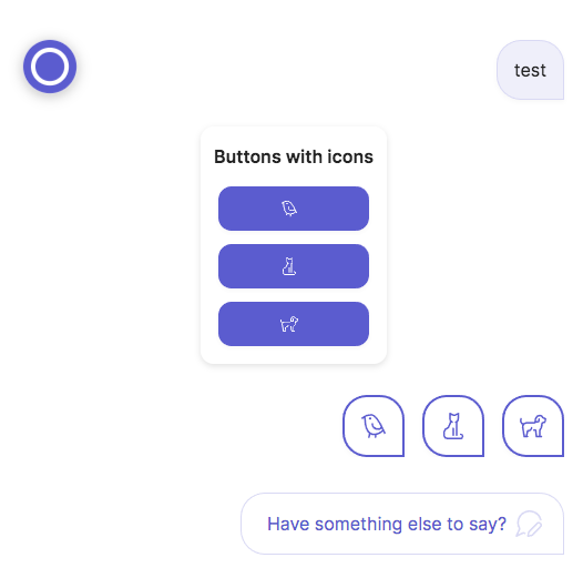
In this example, we’ll use icons in addition to text. Replace the code in buttons.yaml with this:
triggers:
  - keyword: test

steps:
  - buttons:
      - icon: streamline-regular/33-pets-animals/12-wild birds/wild-bird.svg
        text: Bird
        result: bird
      - icon: streamline-regular/33-pets-animals/04-cats/cat-sitting.svg
        text: Cat
        result: cat
      - icon: streamline-regular/33-pets-animals/03-dogs/dog.svg
        text: Dog
        result: dog
    quick_replies:
      - icon: streamline-regular/33-pets-animals/12-wild birds/wild-bird.svg
        text: Bird
        result: bird
      - icon: streamline-regular/33-pets-animals/04-cats/cat-sitting.svg
        text: Cat
        result: cat
      - icon: streamline-regular/33-pets-animals/03-dogs/dog.svg
        text: Dog
        result: dog
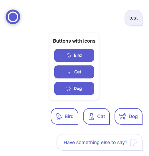
Which produces the following in the Meya Orb Web SDK client:
Example 2
In this example, we’ll use icons on our buttons and quick replies instead of text. You'll need to Install the Meya CLI and setup your local development environment for this example.
- In your app’s root folder, create a file called
config.yaml, if it doesn’t exist already. Copy this code into the file:
icon:
  bird: streamline-regular/33-pets-animals/12-wild birds/wild-bird.svg
  cat: streamline-regular/33-pets-animals/04-cats/cat-sitting.svg
dog: streamline-regular/33-pets-animals/03-dogs/dog.svg- Create a new flow file called
buttons.yamland copy this code into it:
triggers:
  - keyword: test

steps:
  - tiles:
      - title: Buttons with icons
        buttons:
          - icon: (@ config.icon.bird )
            result: bird
          - icon: (@ config.icon.cat )
            result: cat
          - icon: (@ config.icon.dog )
            result: dog
    quick_replies:
      - icon: (@ config.icon.bird )
        result: bird
      - icon: (@ config.icon.cat )
        result: cat
      - icon: (@ config.icon.dog )
        result: dog
After saving the files, run these commands in your terminal:
meya format
meya push
Go ahead and test the new flow in the app’s chat simulator. You should see something like this:
text field
text fieldThe text property lets you specify what text appears in the button or quick reply. Text is an optional property, so you can omit it if you prefer to use an icon, for example.
Example 1
In this example, we’ll create a very simple button and quick reply, both of which will have an inferred type of text.
triggers:
  - keyword: test

steps:
  - buttons:
      - text: This is a button
    quick_replies:
      - text: This is a quick reply
After saving the file, run these commands in your terminal:
meya format
meya push
The result:
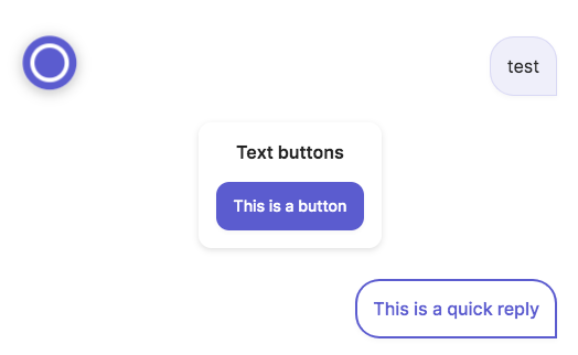
Since thetextbutton type does not produce a dynamic trigger, this flow would normally continue on without waiting for a button click. In this case, though, there are no other steps in the flow, so the flow has not continued. See Dynamic triggers for more detail.
Example 2 (using bot config)
If you want to only specify the text for the button or quick reply and do not care about the other fields, there is an even quicker way to define the element: just specify the text alone, as in this example:
triggers:
  - keyword: test

steps:
  - buttons:
      - This is another button
    quick_replies:
      - This is another quick reply
The output of this will be the same as in the previous example.
action field
action fieldThe action property lets you specify an action to perform when the button or quick reply is clicked. The action itself can be any component.
Example 1
A common use for actions is to jump to another step in the flow when the button is clicked.
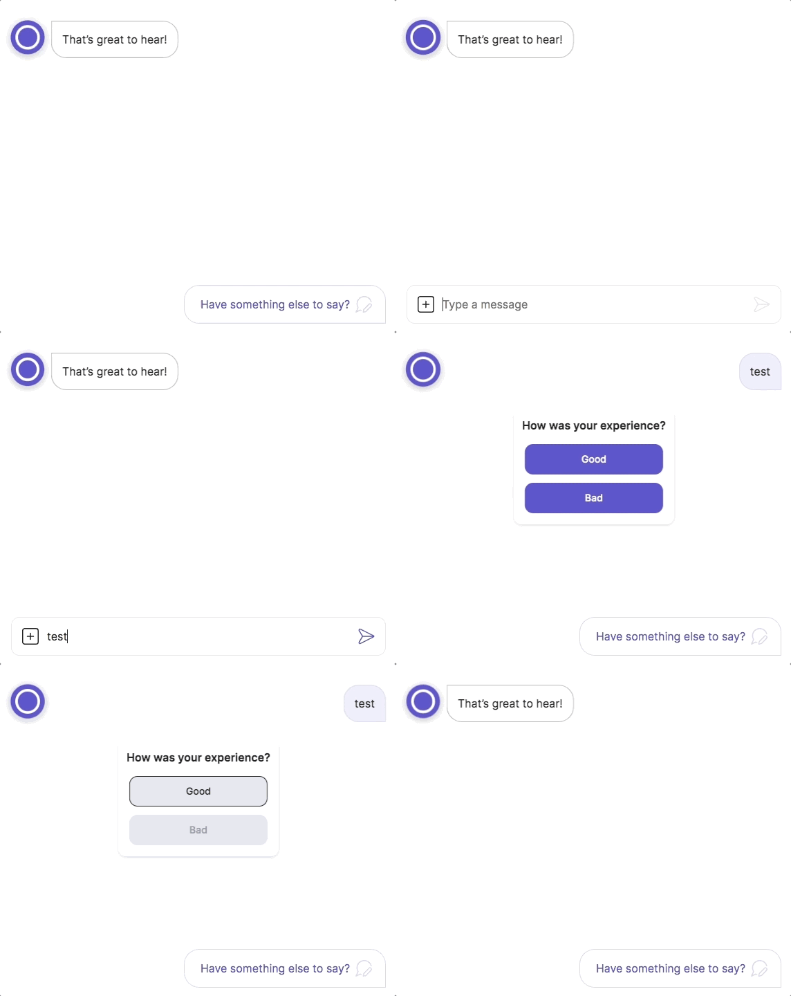
In this example, we use the flow.next component to go to the next step, which has the label good, if the user clicks the Good button. We use the flow.jump component to go to the bad label if the user clicks the Bad button.
triggers:
  - keyword: test

steps:
  - tiles:
      - title: How was your experience?
        buttons:
          - text: Good
            action: next
          - text: Bad
            action:
              jump: bad

  - (good)
  - say: That's great to hear!
  - end

  - (bad)
  - say: I'm sorry to hear that.
The result:
Example 2
This example results in the same output as the previous example, but uses the say component as the action instead of jump and next.
triggers:
  - keyword: test

steps:
  - tiles:
      - title: How was your experience?
        buttons:
          - text: Good
            action:
              say: That's great to hear!
          - text: Bad
            action:
              say: I'm sorry to hear that.
The presence of theactionproperty will cause the button’s inferred type to beaction. Not all fields are compatible with theactionbutton type. Refer to the compatibility section above for more detail.
result field
result fieldMost components and triggers place some output data on flow scope at flow.result. Using the result property, you can place data at flow.result when the user clicks a button or quick reply.
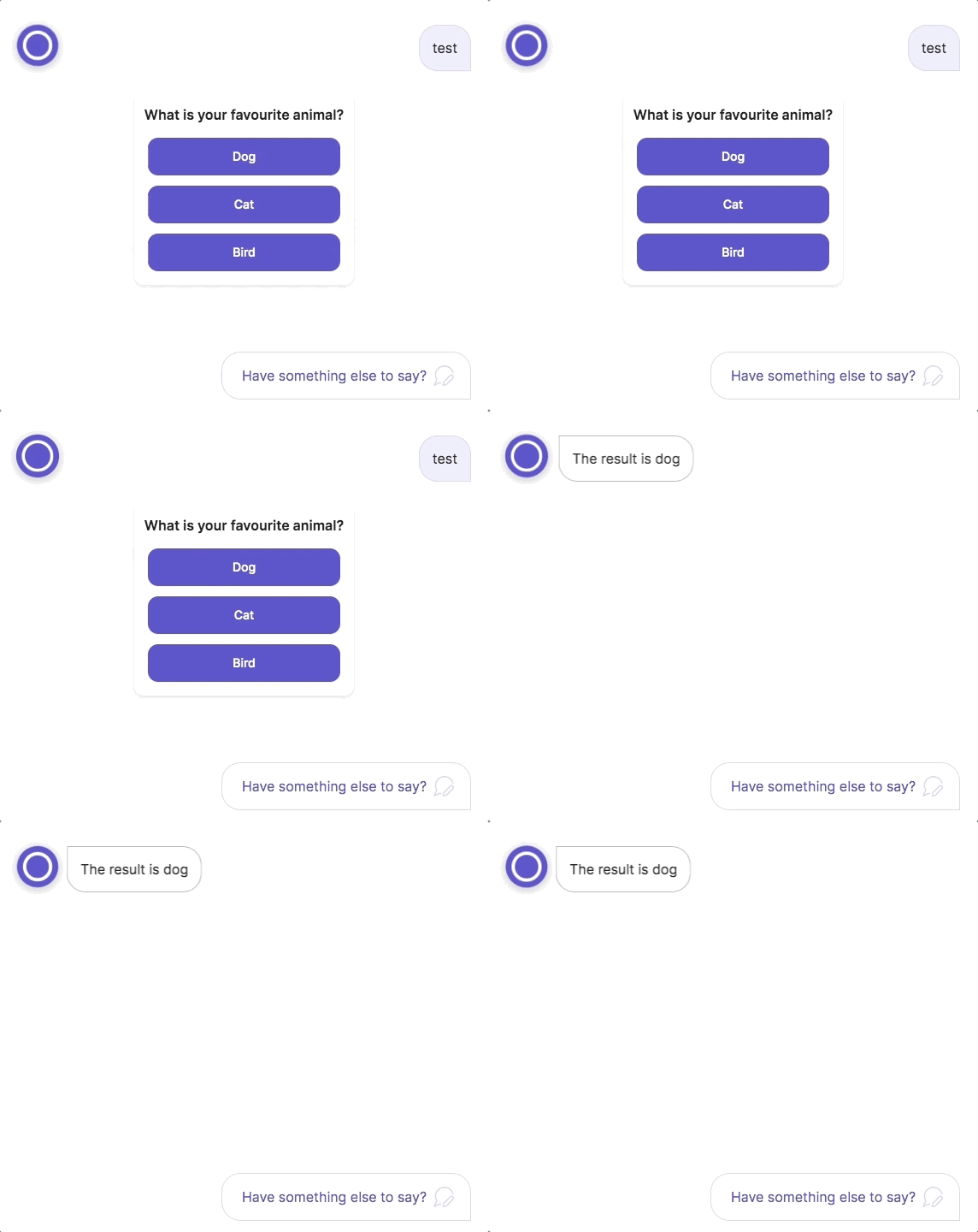
In this example, we store a different value to flow.result depending on what button is clicked.
triggers:
  - keyword: test

steps:
  - tiles:
      - title: What is your favourite animal?
        buttons:
          - text: Dog
            result: dog
          - text: Cat
            result: cat
          - text: Bird
            result: bird
  - say: The result is (@ flow.result )
The result:
The presence of theresultproperty will cause the button’s inferred type to beflow_next. Not all fields are compatible with theflow_nextbutton type. Refer to the compatibility section above for more detail.
data field
data fieldThe data property allows you to save data to the flow scope when the button or quick reply is clicked.
triggers:
  - keyword: test

steps:
  - tiles:
      - title: Saving data with buttons.
        buttons:
          - text: This is a button
            data:
              count: 1
              foo: bar
              my_list:
                - a
                - b
                - c
  - say: (@ flow.count | string )
  - say: (@ flow.foo )
  - say: (@ flow.my_list | string )
After clicking the button, you should see this output:
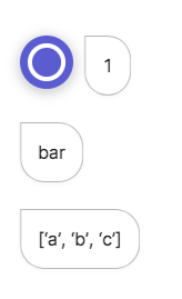
The presence of thedataproperty will cause the button’s inferred type to beflow_next. Not all fields are compatible with theflow_nextbutton type. Refer to the compatibility section above for more detail.
context field
context fieldThe context property is a dictionary of information that is added to the entry. This means you can search your app logs for data stored in the context dictionary.
This information is also sent to the frontend chat integration, meaning you could use it to pass additional data and have the frontend react to it in some manner.
triggers:
  - keyword: test

steps:
  - tiles:
      - title: Button that uses context.
        buttons:
          - text: This is a button
            context:
              count: 1
              foo: bar
              my_list:
                - a
                - b
                - c
  - say: Done!
Run the flow in the chat simulator, then head to the Logs page. Enter this query into the search bar:
buttons.0.context.foo:barYou should see an entry appear, and if you examine the data, you’ll see it is a meya.button.event.ask entry generated by our button click, and that it contains our context dictionary.
magic field
magic fieldA magic button is one that is not displayed to the user. Instead of being clicked on, they are triggered when the user clicks a magic link.
One example of how this could be used is to verify a user’s email address. The bot can create a magic button and a magic link for the button, then email the magic link to the user. When the magic link is clicked, the button is triggered and causes the bot to take an action.
If a button or quick reply does not set the text, icon, or url fields, it is considered magic by default. You can also explicitly set the magic property to true.
button_id field
button_id fieldButton IDs allow the Meya platform to know which button the user clicked. When the user clicks a button, the button’s ID is passed back to the app and any additional functionality associated with that button, such as storing data or running another component, will be performed.
Despite the name, quick replies can also have button IDs.
The presence of thebutton_idproperty will cause the button’s inferred type to bestatic. Not all fields are compatible with thestaticbutton type. Refer to the compatibility section above for more detail.
Button IDs can be auto-generated or explicitly defined. Both types are described below.
Auto-generated button IDs
Buttons with a type of static, action, flow_next, or component_next will have a button ID automatically generated by the Meya platform. From the compatibility section above, you can see this means that specifying a button’s action, result, data, or javascript fields will result in a button ID being created.
Static button IDs
You can also explicitly define a button ID for a button or quick reply. This causes the button’s inferred type to be static.
Static button IDs can be used with button triggers to create buttons that launch specific flows, or with magic links.
Let’s create a button that launches a flow using the button_id trigger.
triggers:
  - keyword: test

steps:
  - tiles:
      - title: Button with button ID.
        buttons:
          - text: This is a button
            button_id: my_button
Create a second flow called button_id.yaml.
triggers:
  - button_id: my_button

steps:
  - say: Triggered by my_button
Trigger the first flow and click the button. The button_id flow should be triggered:
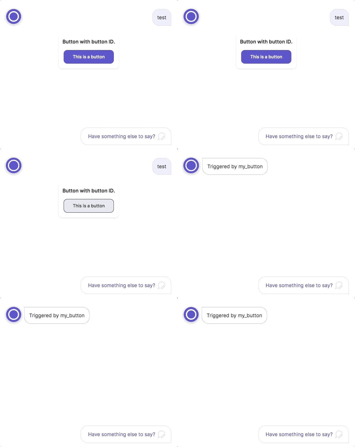
Updated 10 months ago
