
Composer
Controlling the text input composer with BFML.
This is only applicable to the Meya Orb Web SDK and the Meya Orb Mobile SDK.
The composer is the main input section that a user will use to:
- Type and submit text.
- Upload files.
- Upload photos/images.
- Take and upload a photo with their phone's camera (this is only applicable to Meya Orb Mobile SDK).
By default, the input composer will always be shown with the text input field visible. This allows a user to focus the text input field and start typing a message.
Some input components such as the image.ask component will change the composer to show the File and Photo buttons automatically.
Controlling the composer
The composer can be customized in BFML using the composer spec, which has a number of fields that allow you to control what the composer looks like. Here is the composer spec definition:
composer:
  focus: file|image|text|blur
  placeholder: STRING
  collapse_placeholder: STRING
  visibility: collapse|hide|show
In Python the composer spec is defined by the ComposerElementSpec class, and is defined as an optional field in the InteractiveComponent class.
All basic input and output components such as text.ask and text.say components inherit from the InteractiveComponent class, and thus these components can control how the composer behaves.
Visible
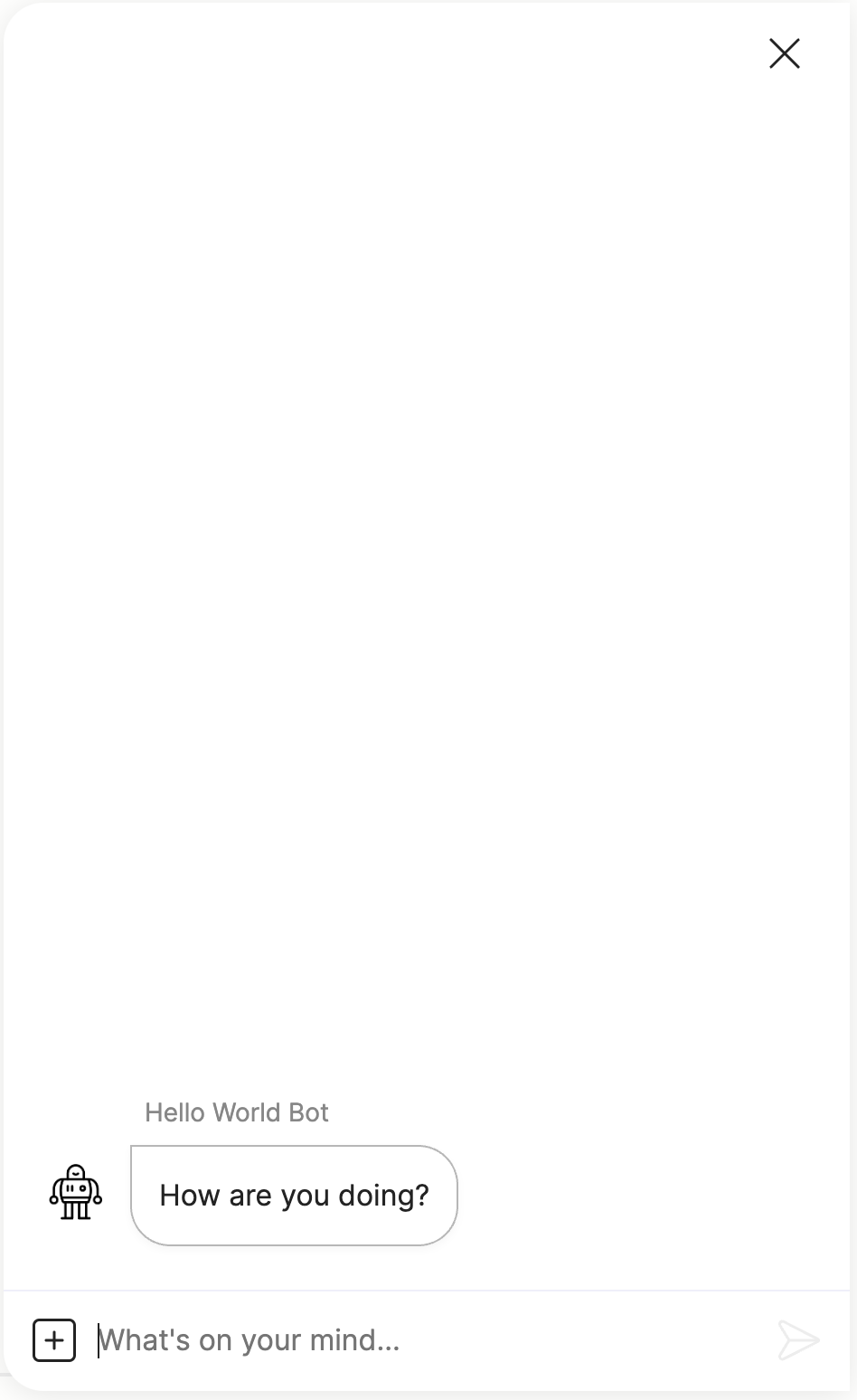
In this example the text.say component will set the composer to display the text input with keyboard focus and display a custom placeholder text.
steps:
  - say: How are you doing?
    composer:
      focus: text
      placeholder: What's on your mind...
      visibility: show
Which produces the following:
Collapsed
In this example the text.say component will collapse the composer with custom placeholder text that allows a user to show the text input when they click the composer.
steps:
  - say: Which is your favourite color?
    quick_replies:
      - Red
      - Blue
    composer:
      focus: blur
      placeholder: Type in a color
      visibility: collapse
      collapse_placeholder: Click to type a color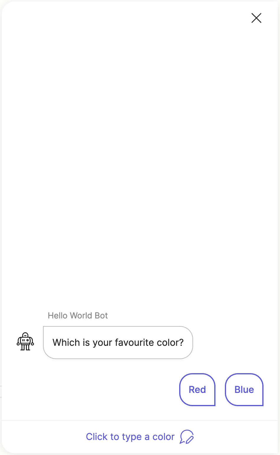
Hidden
In this example the text.say component will hide the composer altogether. Using this you can force a user to select a button/quick reply, or input using the form.
steps:
  - type: meya.text.component.input
    label: Favourite color
    required: true
    placeholder: Type your favourite color...
    quick_replies:
      - text: I don't like color
      - text: What's the meaning of color?
    composer:
      focus: blur
      visibility: hide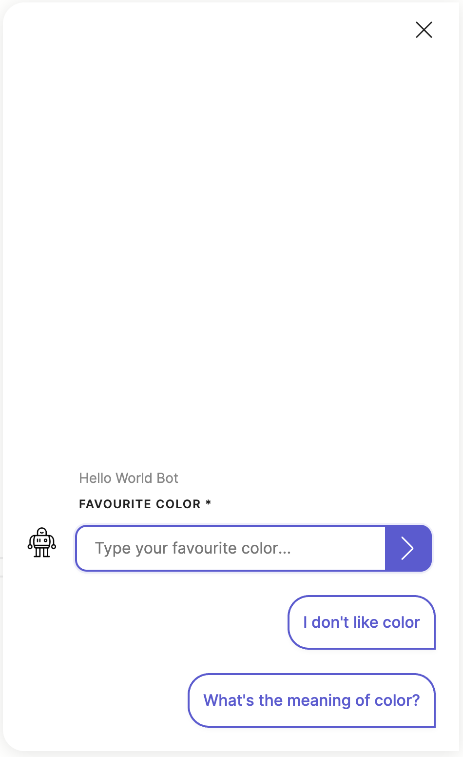
File or image
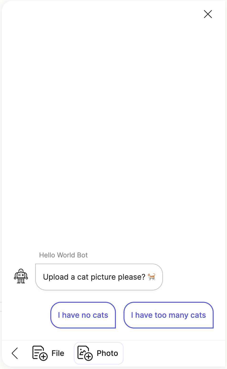
In this example the text.say component will show the composer and give focus to the Photo button. (The same can be done for the File button.)
steps:
  - say: Upload your profile picture...
    quick_replies:
      - No thanks
      - Privacy policy
    composer:
      focus: image
      visibility: show
Default composer config
You can customize the default composer values by specifying the compose config in the Orb config for both the Meya Orb Web SDK and the Meya Orb Mobile SDK.
You can also customize the composer config using the Orb integration settings, here is an example:
type: meya.orb.integration
markdown: true
theme:
  brand_color: '#4989ea'
launcher:
  type: message
  text: Help
collect:
  location: user
composer:
  visibility: show
  placeholder_text: Type here...
  file_button_text: Upload File
  file_send_text: Upload
  image_button_text: Upload Photo
  camera_button_text: Capture
  gallery_button_text: Photo Gallery
Updated about 2 months ago