Select
The select form great for gathering multiple-choice input. It can be used for age ranges, product configuration, menu navigation, and more.
Feature overview:
customenables user-specified optionssearchenables typing to filter optionsmultienables multiple options to be selected at oncedefaultsets a preselected optiondisabledmakes an option unselectablevalueallows overriding an option's result when selected
Current limitations
multimode does not supportsearchmultimode does not supportcustomplaceholderis only supported incustommode
Basic
Here is the most basic use of the select form, get an age range. Text can be specified directly as the option item, or using the text field.
triggers:
  - keyword: select_basic

steps:
  - select: Age
    options:
      - 10-19
      - 20-60
      - text: 60+
  - say: Your age range is (@ flow.result )
    quick_replies:
      - select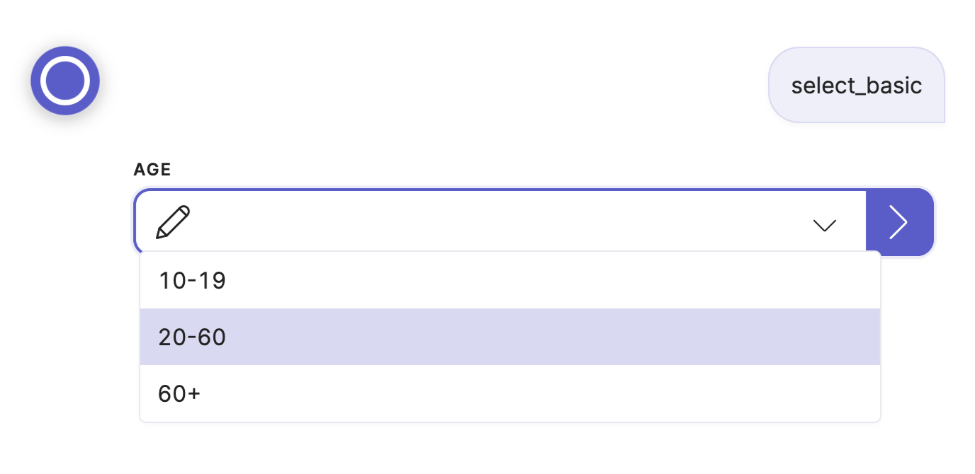
Custom
Here custom is enabled, and the user an pick one of the supplied options or type their own response. The placeholder is shown by default.
triggers:
  - keyword: select_custom

steps:
  - select: Activity
    icon: streamline-bold/01-interface-essential/02-dashboard/pie-line-graph-desktop.svg
    custom: true
    placeholder: Enter here
    options:
      - Ride a bike
      - Drive a car
      - Go on boat ride
  - say: You'd like to (@ flow.result )!
    quick_replies:
      - select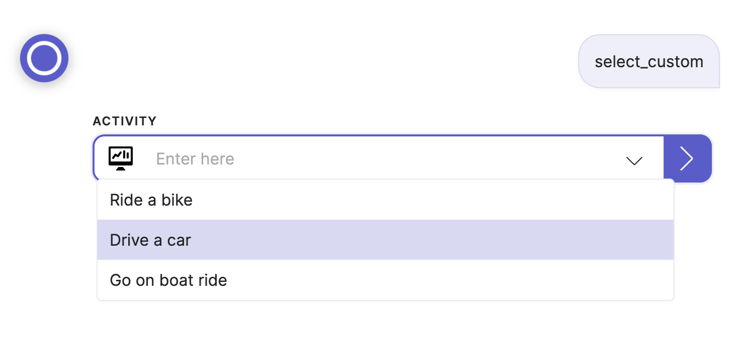
Search
With search the user can type to filter the shown options:
triggers:
  - keyword: select_search

steps:
  - select: Month
    icon: streamline-bold/01-interface-essential/02-dashboard/pie-line-graph-desktop.svg
    search: true
    options:
      - January
      - February
      - March
      - April
      - May
      - June
      - July
      - August
      - September
      - October
      - November
      - December
      - janvier
      - février
      - mars
      - avril
      - mai
      - juin
      - juillet
      - août
      - septembre
      - octobre
      - novembre
      - décembre
  - say: You've selected (@ flow.result )
    quick_replies:
      - select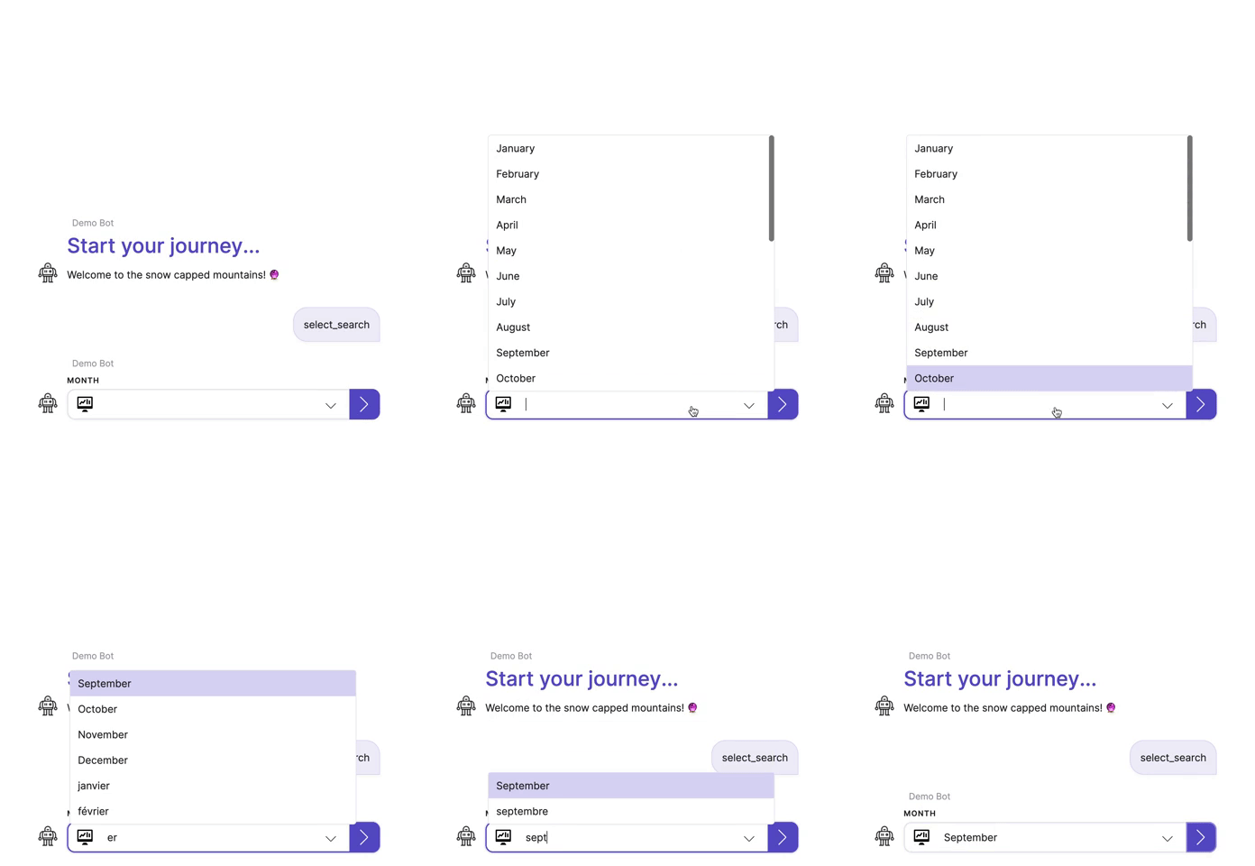
Multi
Use multi to allow multiple options to be selected. The result will be a list of values.
triggers:
  - keyword: select_multi

steps:
  - select: Pizza Toppings
    icon: streamline-bold/01-interface-essential/02-dashboard/pie-line-graph-desktop.svg
    multi: true
    options:
      - Pineapple
      - Tomato
      - text: Pepperoni
      - text: Onions
      - Cheese
  - say: You've selected the following toppings... (@ flow.result )
    quick_replies:
      - select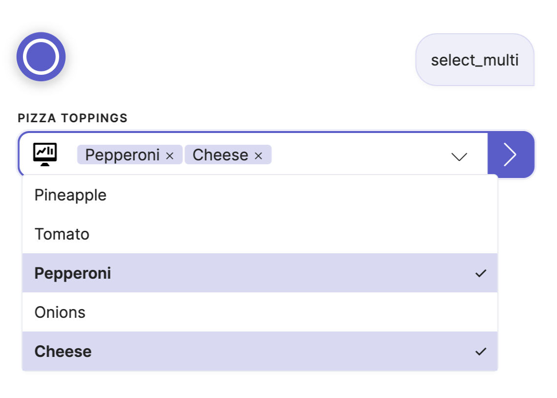
Default
The default can be used to pre-fill a selection:
triggers:
  - keyword: select_default

steps:
  - select: Subscription
    default: Monthly
    options:
      - Pay-as-you-go
      - Monthly
      - Yearly
  - say: Your subscription is (@ flow.result )
    quick_replies:
      - select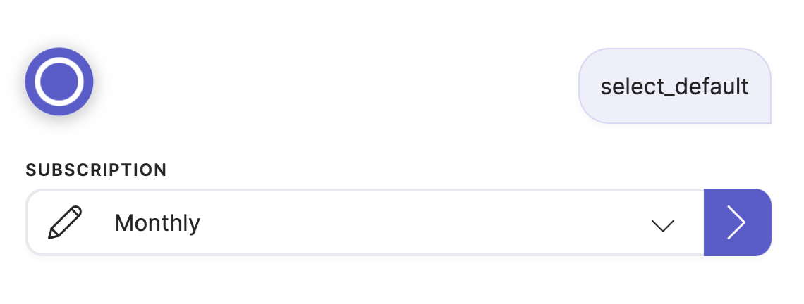
Disabled
If you want to show an option but make it unselectable, use disabled (e.g. for out-of-stock product variants):
triggers:
  - keyword: select_disabled

steps:
  - select: Manufacturer
    icon: streamline-bold/01-interface-essential/02-dashboard/pie-line-graph-desktop.svg
    options:
      - EVOO
      - A Open
      - text: ABIT
        disabled: true
      - text: Acer
  - say: You've selected (@ flow.result )
    quick_replies:
      - select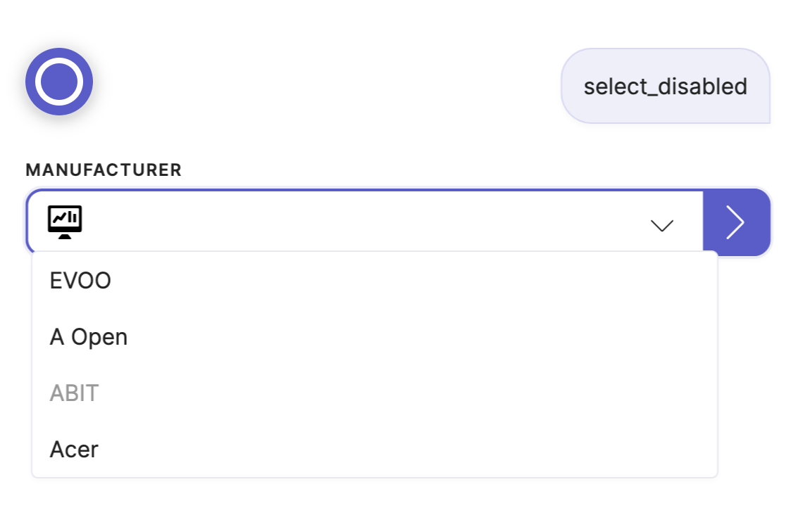
Value
The value can be used to override the option's value (which defaults to the option's text). All valid JSON values are supported.
triggers:
  - keyword: select_value_advanced

steps:
  - select: Product
    icon: streamline-bold/01-interface-essential/02-dashboard/pie-line-graph-desktop.svg
    multi: true
    default:
      - Other
      - Extra
    options:
      - text: Pencils
        value: [4, 8, 9]
      - text: Paper
        value:
          lined: true
          quantity: 50
      - Other
      - text: Extra
        value: false
      - text: N/A
        value:
  - say: You've selected (@ flow.result )
    quick_replies:
      - select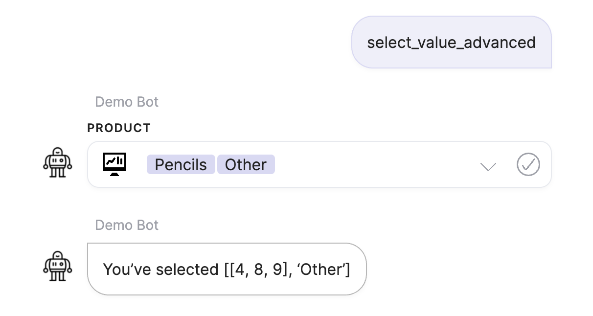
Updated 11 months ago
