Widgets & Pages
Beta releaseThe new features here are currently in beta. Try it out and let us know what you think!
Meya Widgets are the foundational UI elements of a rich, interactive Meya Orb experience. They include buttons, text input, multiple choice options, checkboxes, and image/file media.
Widgets can be used in standalone mode, or they can be used inside of Meya Pages. Pages present multiple UI elements to the user at one time, which is great for building multi-field forms and multi-step wizards.
Integration supportAll of the features documented here are supported in both the Orb Web SDK and the Orb Mobile SDK. Many advanced features are not supported in other integrations.
Standalone mode
In standalone mode, all you need to do is add a step for the widget component and the orb client will show the widget. For input widgets, the flow will advance once valid input is provided, and the flow.result variable will be populated.
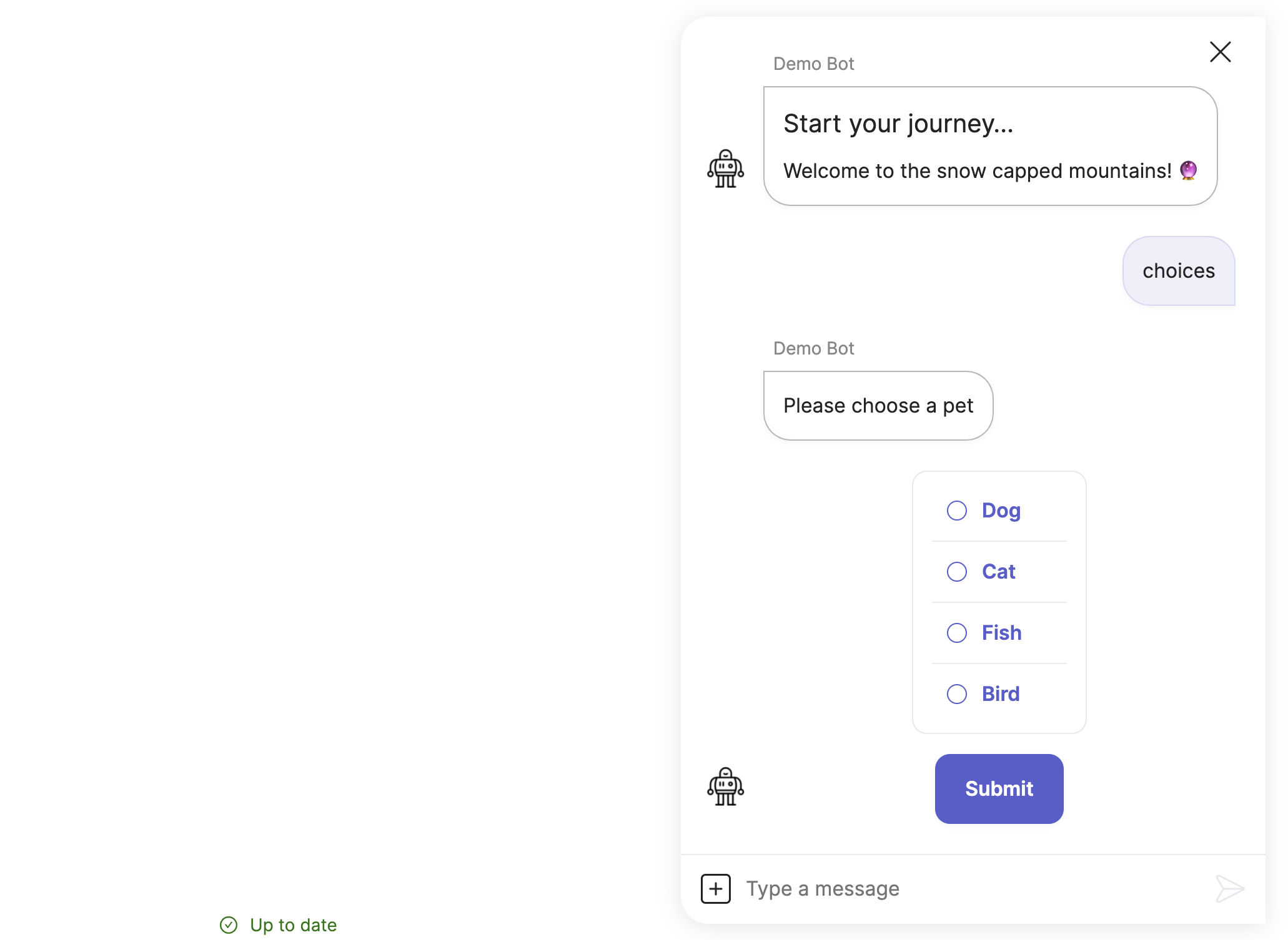
Here's an example of multiple choices:
triggers:
  - keyword: choices

steps:
  - say: Please choose a pet
  - choices:
      - Dog
      - Cat
      - Fish
      - Bird
    required: true
  - say: You picked (@ flow.result )!
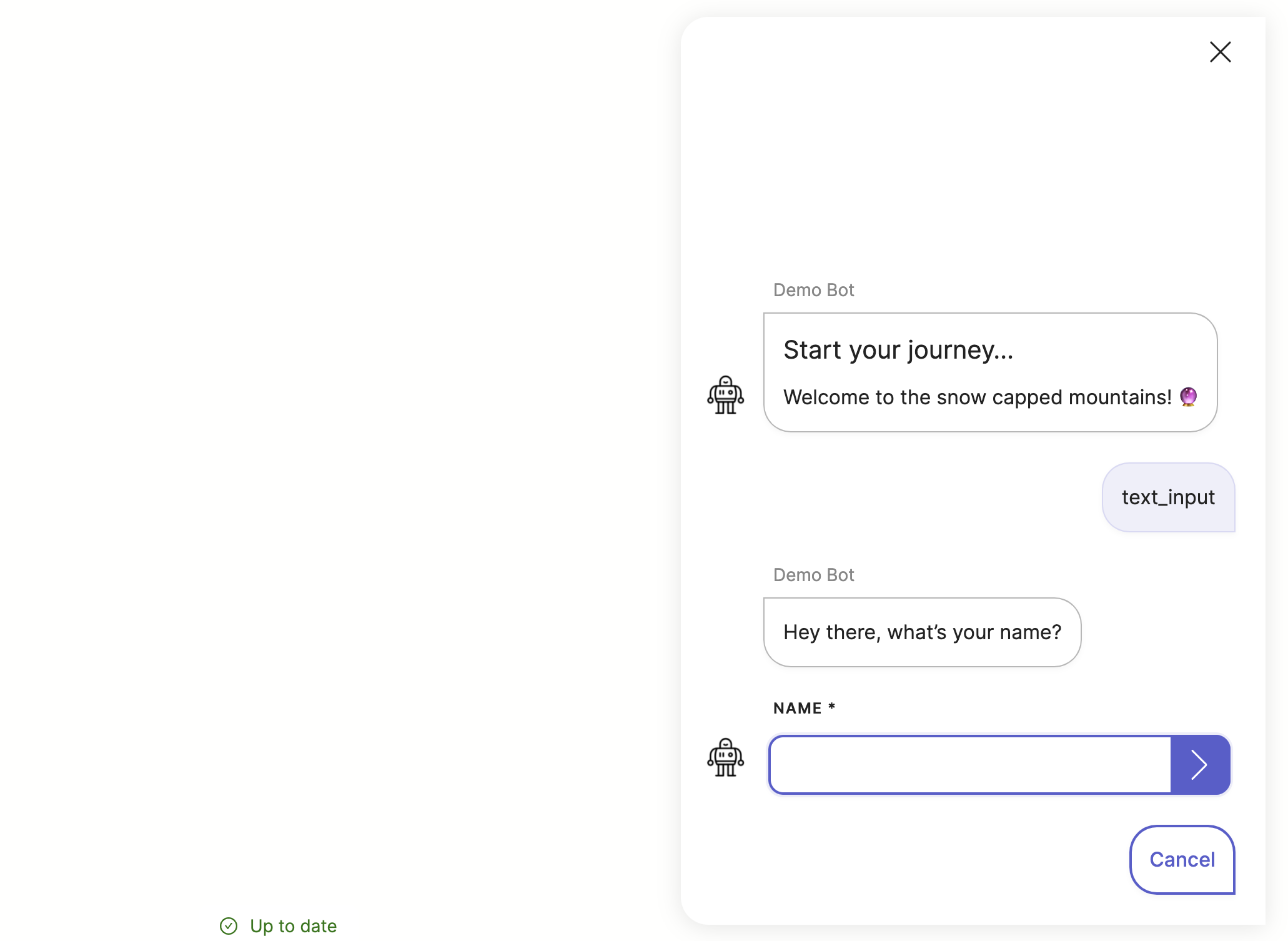
Another common widget is text input. You can hide the composer simplify the experience, and you can use quick replies like this to allow skipping the question or cancelling the flow:
triggers:
  - keyword: text_input

steps:
  - say: Hey there, what's your name?
  - type: text_input
    label: Name
    required: true
    composer:
      visibility: hide
    quick_replies:
      - text: Cancel
        action:
          jump: cancel
  - user_set: name
  - say: Nice to meet you, (@ user.name ) 🔥
  - end

  - (cancel)
  - say: No problem, let me know later if you want to start over
Page mode
To build a page, you specify a list of widgets you want to show. These can be any combination of display and/or input widgets. After user clicks the submit button and the whole page passes validation, the flow continues to the next step, and flow.result will contain a list of input results.
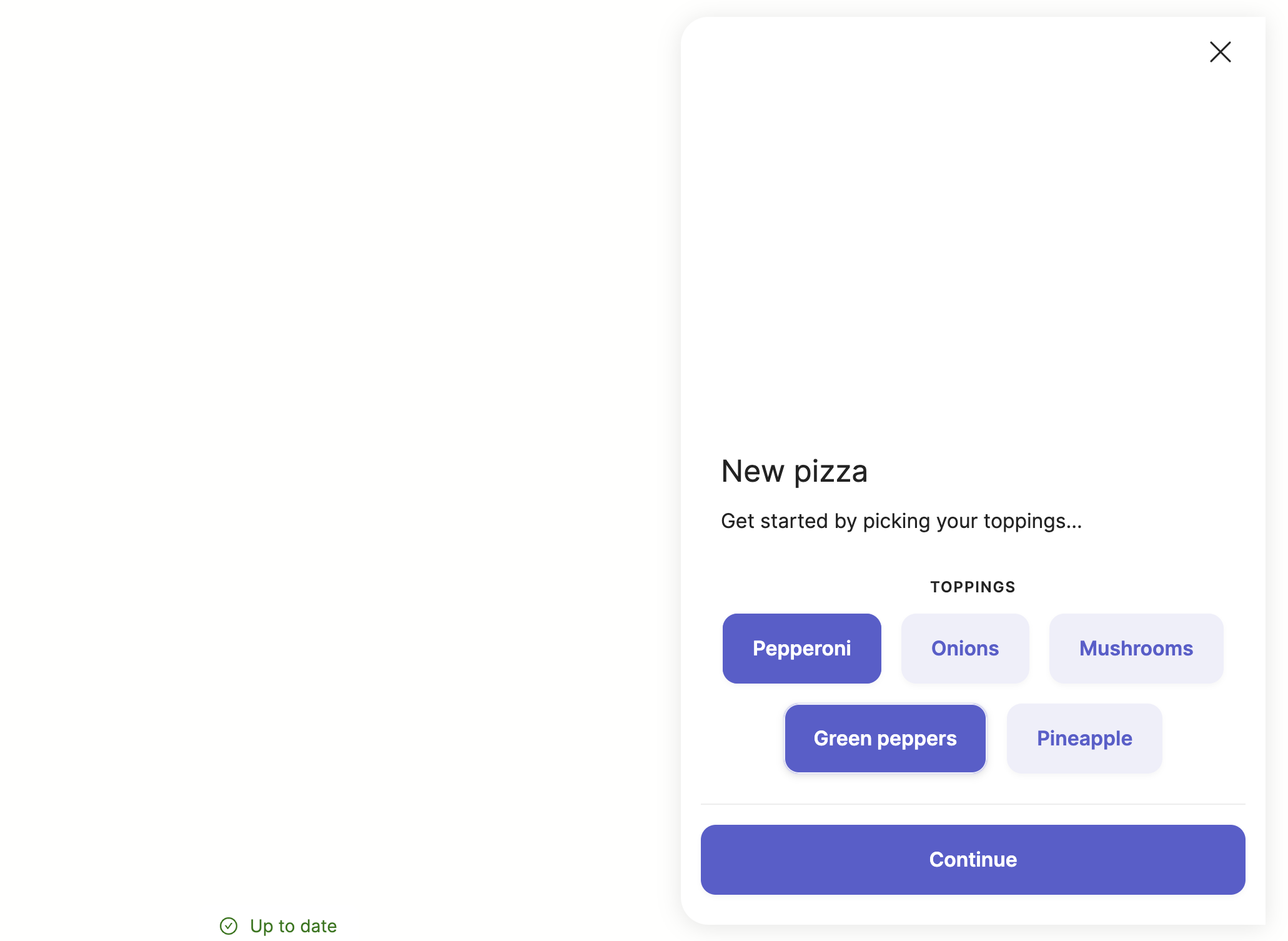
Here's an example of a page with info and multi-select buttons (note, the submit button text can also be customized):
triggers:
  - keyword: page_buttons

steps:
  - page:
      - info: |
          # New pizza
          Get started by picking your toppings...
      - label: Toppings
        buttons:
          - Pepperoni
          - Onions
          - Mushrooms
          - Green peppers
          - Pineapple
        multi: true
    submit:
      text: Continue

  - say: Your input is (@ flow.result )
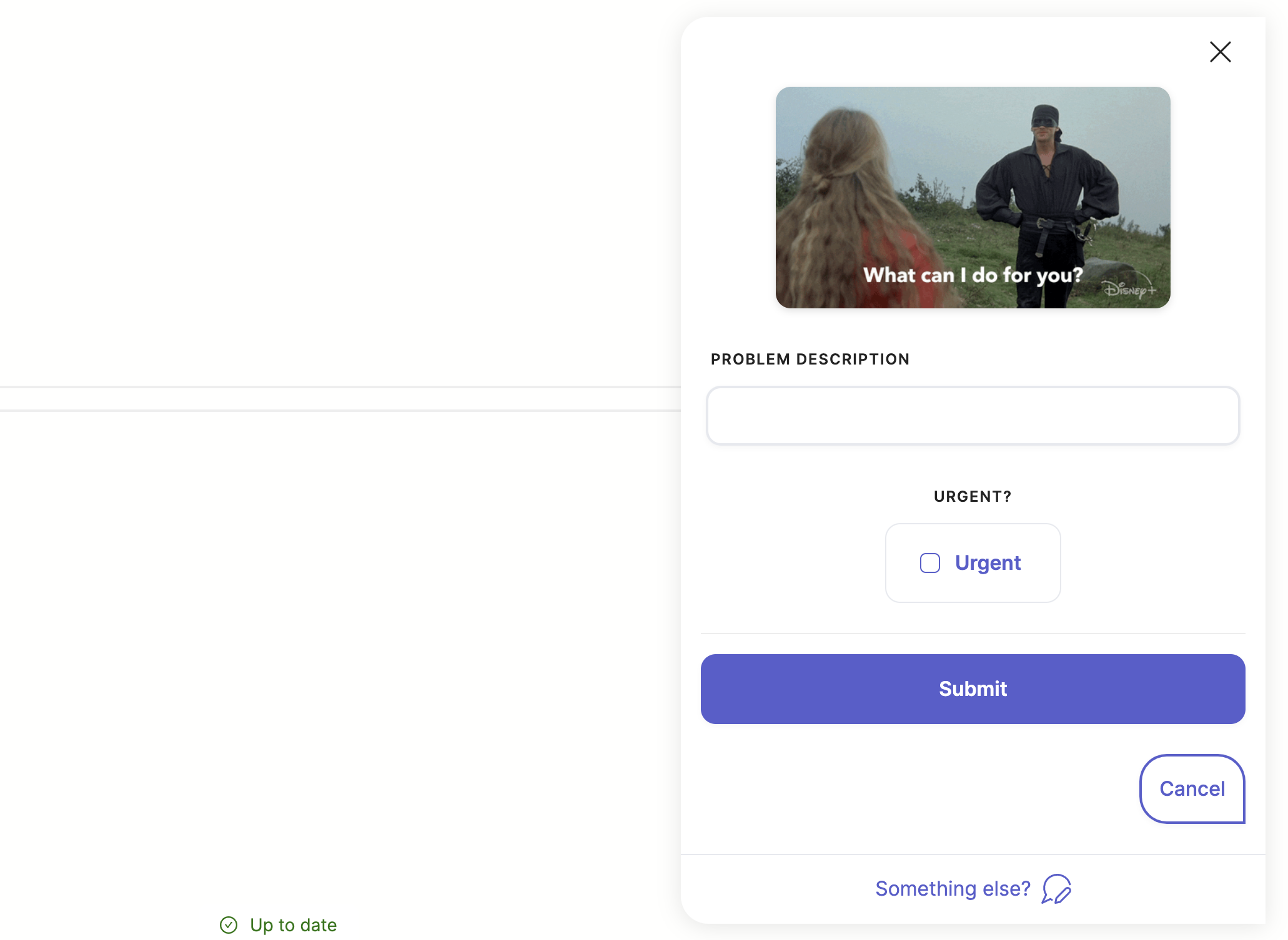
Just like with widgets, the page composer and quick replies can be modified to suit your design. Here's another example:
triggers:
  - keyword: page_help

steps:
  - page:
      - image: https://media.giphy.com/media/mBjnbBkZbOp1t7nkQo/giphy.gif
        alt: What can I do for you?
      - label: Problem description
        type: text_input
      - label: Urgent?
        checkbox: Urgent
    composer:
      visibility: collapse
      placeholder: Something else?
    quick_replies:
      - text: Cancel
        action: end

  - say: Your input is (@ flow.result )
Reference docs
Here are the reference docs for all currently supported widgets:
- text.info
- image.v2
- file.v2
- button.ask
- tile.choice
- tile.checkbox
- text.input
- text.regex_input
- email.address.input
- facebook.wit.input
- google.dialogflow.input
And here are the reference docs for the pages component:
Updated 11 months ago
