
Tiles
With tiles, your bot can display rich data to a user and get button click responses.
Feature overview:
- Show one or more tiles
- Use row or column layout
- Display an image or icon at the top of the tile
- Include title and/or description text
- Display tabular data (e.g. price, availability, size, etc.)
- Add multiple buttons (action, text, or URL buttons)
Compatibility notes (Zendesk Sunshine Conversations)
- Only row layout is supported
- Tabular data is not supported
- Quick replies are not supported
Basic usage
Here's how to show two tiles with images and buttons:
triggers:
  - keyword: tile_basic

steps:
  - say: Here are the currently available rewards...
  - tiles:
      - title: Super Nintendo Entertainment System
        description: 100,000 points
        image:
          url: https://upload.wikimedia.org/wikipedia/commons/thumb/3/31/SNES-Mod1-Console-Set.jpg/800px-SNES-Mod1-Console-Set.jpg
        buttons:
          - text: Order
            result: nintendo
      - title: Sega Genesis
        description: 75,000 points
        image:
          url: https://upload.wikimedia.org/wikipedia/commons/thumb/6/6a/Sega-Genesis-Mk2-6button.jpg/800px-Sega-Genesis-Mk2-6button.jpg
        buttons:
          - text: Order
            result: sega
  - say: Great! Your first (@ flow.result ) is on the way!
Advanced
Here's an advanced use that combines images, tabular data, and link buttons:
triggers:
  - keyword: tile_advanced

steps:
  - ask: Advanced tiles
    tiles:
      - image:
          url: https://cataas.com/cat/says/Tile%200
        title: Title 0
        rows:
          -   - cell: How
                value: harvesting
              - cell: A
                value: clouds
          -   - cell: Away
                value: far
              - cell: Harvesting
                value: ship
        buttons:
          - url: https://cataas.com/cat/says/Link%20button%203
            text: Link button 3
          - url: https://cataas.com/cat/says/Link%20button%204
            text: Link button 4
          - text: Button 5
            result: 5
          - text: Button 6
            result: 6
        description: Circumnavigated how far away ship of the imagination star stuff
          harvesting star light great turbulent clouds a billion trillion
      - image:
          url: https://cataas.com/cat/says/Tile%201
        title: Title 1
        rows:
          -   - cell: Stuff
                value: trillion
              - cell: Light
                value: circumnavigated
          -   - cell: How
                value: of
              - cell: Harvesting
                value: billion
        buttons:
          - url: https://cataas.com/cat/says/Link%20button%207
            text: Link button 7
          - url: https://cataas.com/cat/says/Link%20button%208
            text: Link button 8
          - text: Button 9
            result: 9
          - text: Button 10
            result: 10
        description: Circumnavigated how far away ship of the imagination star stuff
          harvesting star light great turbulent clouds a billion trillion
      - image:
          url: https://cataas.com/cat/says/Tile%202
        title: Title 2
        rows:
          -   - cell: Circumnavigated
                value: great
              - cell: Imagination
                value: ship
          -   - cell: Turbulent
                value: of
              - cell: Turbulent
                value: light
        buttons:
          - url: https://cataas.com/cat/says/Link%20button%2011
            text: Link button 11
            context: {}
          - url: https://cataas.com/cat/says/Link%20button%2012
            text: Link button 12
          - text: Button 13
            result: 13
          - text: Button 14
            result: 14
        description: Circumnavigated how far away ship of the imagination star stuff
          harvesting star light great turbulent clouds a billion trillion
  - say: Flow result (@ flow.result )
Tile spec
Each tile in a tiles component is defined using a tile spec that specifies how the data is presented, how the buttons work etc. This tile spec maps to the TileElementSpec Python class that gets used in the tile component to generate the tile.ask event.
title field
title fieldThis is the title of the tile and is displayed below the image and above the description, data cells and buttons. The title is always displayed in bold.
Note, that Markdown is not supported for the title field.
steps:
  - tiles:
    - title: Super Nintendo Entertainment System
      description: 100,000 points
      image:
        url: https://upload.wikimedia.org/wikipedia/commons/thumb/3/31/SNES-Mod1-Console-Set.jpg/800px-SNES-Mod1-Console-Set.jpg
      buttons:
        - text: Order
          result: nintendo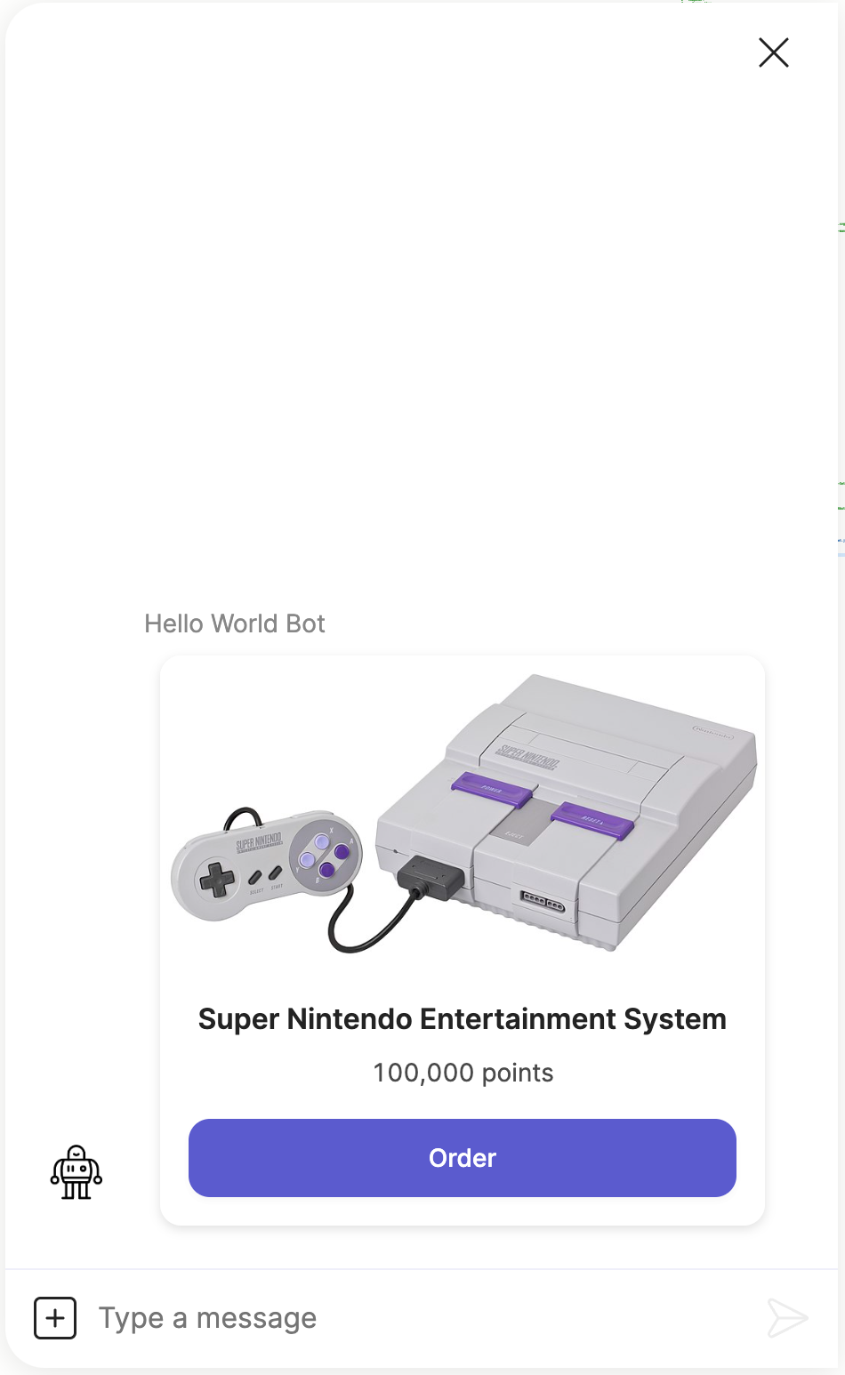
description field
description fieldThis defines block of text that displayed directly below the title. The text is alway justified to the centre.
Note, that Markdown is not supported for the description field.
Here is a tile with just a title and description:
steps:
  - tiles:
    - title: Super Nintendo Entertainment System
      description: |
        Circumnavigated how far away ship of the imagination star stuff
        harvesting star light great turbulent clouds a billion trillion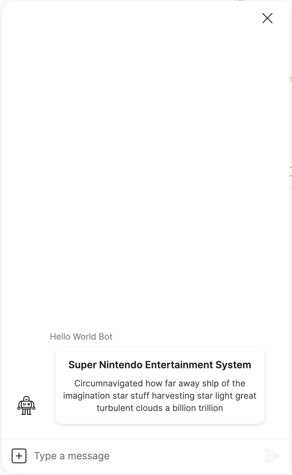
image field
image fieldThis defines a tile image that gets displayed just above the title. When an image is defined it will always be displayed at the top of the tile and it's placement cannot be customized.
An image is defined using the tile image spec with the following fields:
url: The URL of the image to be displayed.alt: Optional text that will be displayed if the image could not be loaded.
Make sure the image's resolution is high enough, because the Orb client will size the image to fit into the tile, and therefore low resolution images could look pixelated.
Here is an example of a tile with an image and a button.
steps:
  - tiles:
    - image:
        url: https://upload.wikimedia.org/wikipedia/commons/thumb/3/31/SNES-Mod1-Console-Set.jpg/800px-SNES-Mod1-Console-Set.jpg
      buttons:
        - text: Order
          result: nintendo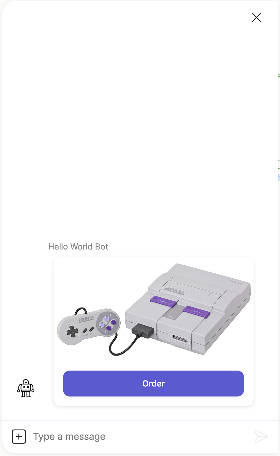
rows field
rows fieldThis field allows you to display text data in tabular layout, and is very useful for presenting small bits of text data such as product specs, dimensions or properties.
Each table cell is defined using a tile cell spec with the following fields:
cell: The title text. This is always displayed in bold above the cell value.value: The cell text.
Here is an example of a tile that displays a title and some product specs:
steps:
  - tiles:
    - title: Tesla
      rows:
        -   - cell: Model
              value: Model S
            - cell: Range
              value: 637 km
        -   - cell: Top Speed
              value: 322 km/h
            - cell: Peak Power
              value: 1,020 hp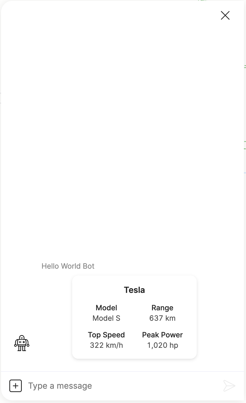
buttons field
buttons fieldThis field defines a list of buttons that will be displayed below the description and rows. Each button is defined by a button spec that specifies how the button is displayed and functions. This is the same button spec that is used to define normal buttons and quick replies.
Here is an example of a tile with a title and a list of buttons:
steps:
  - tiles:
    - title: Tesla Model S
      buttons:
        - url: https://www.tesla.com/en_ca/models
          text: Model S Page
        - text: Buy Now
          result: buy
        - text: Contact Sales
          result: sales
        - text: Contact Support
          result: support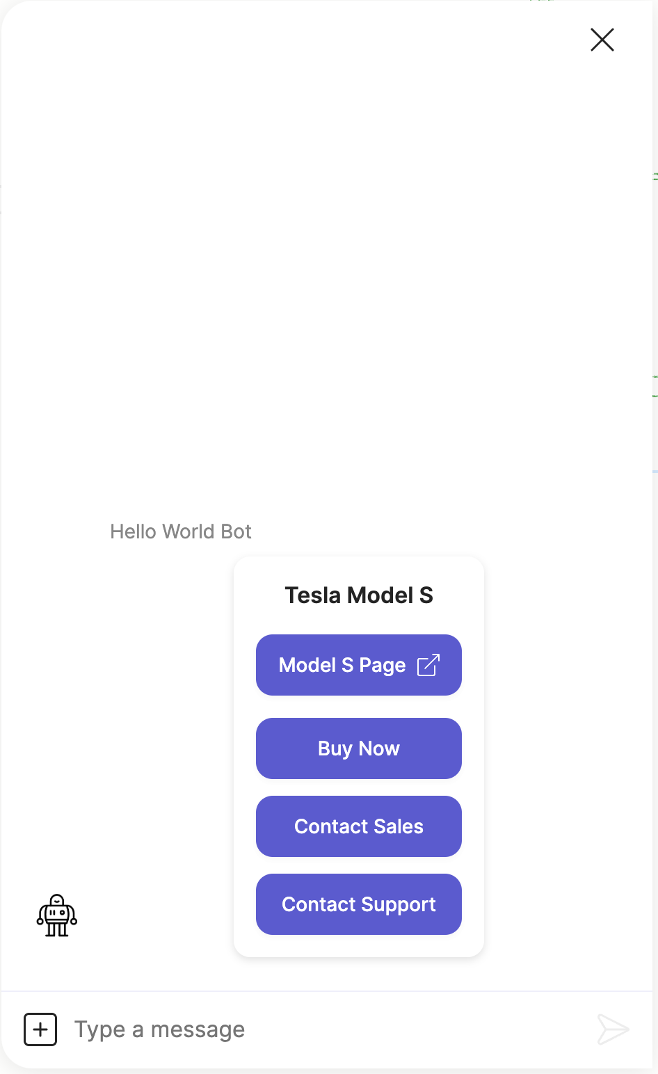
Button style
The tile component allows you to change the display style and behaviour of the group of buttons defined in each tile.
Note, this is unique to the tiles component and these button styles do not apply to the normal buttons or quick replies, even though they use the same button spec.
action style
action styleThis displays the group of buttons as standard action buttons.
steps:
  - button_style: action
    tiles:
      - title: Do you want to continue?
        buttons:
          - text: Yes
            result: true
          - text: No
            result: false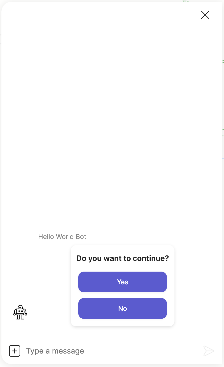
radio style
radio styleThis displays the group of buttons as radio buttons.
steps:
  - ask:
    button_style: radio
    layout: column
    tiles:
      - title: How many copies?
        buttons:
          - text: "1"
            result: 1
          - text: "2"
            result: 2
          - text: "3"
            result: 3
          - text: "4+"
            result: 4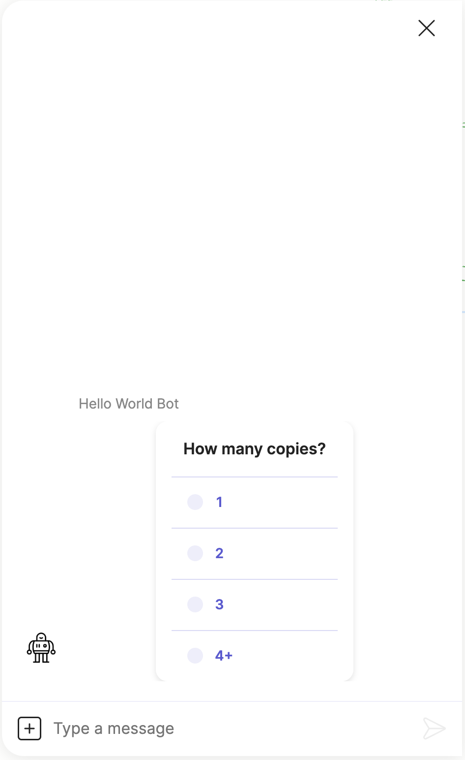
text style
text styleThis displays the group of buttons as flattened text style buttons.
steps:
  - button_style: text
    tiles:
    - title: Tesla Model S
      buttons:
        - url: https://www.tesla.com/en_ca/models
          text: Model S Page
        - text: Buy Now
          result: buy
        - text: Contact Sales
          result: sales
        - text: Contact Support
          result: support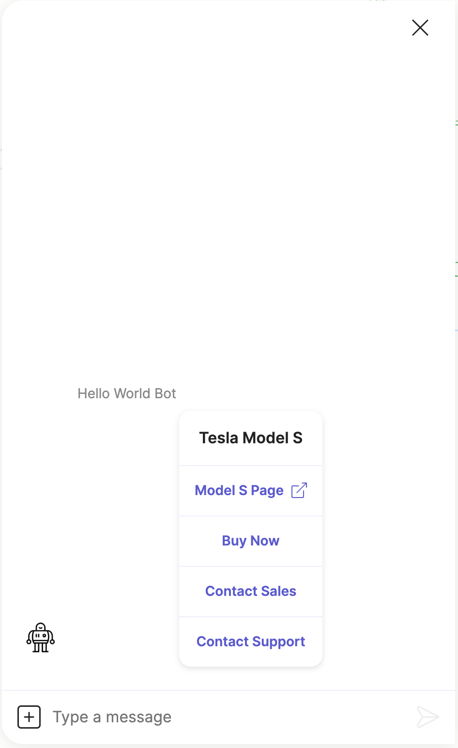
Updated about 2 months ago