Actions on Google components
Actions on Google is compatible with not only phones, but also smart displays and speakers. For your bot to work on these platforms, you'll need to use special Meya component properties. There are also some special bot design decisions to consider. These properties and design options are summarized on this page.
Suggestion chips
In Actions on Google, buttons and suggestions are displayed as suggestion chips. Specifically, these components use suggestion chips:
- meya.text_buttons
- meya.text_suggestions
- meya.image_buttons
- meya.image_suggestions
- meya.card
- meya.cards
- meya.list
- meya.table
Start buttons are not supported in Actions on Google.
Google limits the number of link buttons that can appear on a card depending on the card type and surface type (e.g. smart display). Review the component documentation below for more detail.
In addition, there can never be more than eight suggestion chips on a card. Each chip must contain no more than 25 characters.
meya.card
Supported surfaces: phone, smart display
A basic card designed to present key information to users in a concise manner. They can contain text, an image, and suggestion chips.
Property | Description | |
|---|---|---|
| The title of the card | Optional |
| A one-line string. Extra characters are truncated. |
|
| The text to output. This text must not include a URL. The text may take up to 10 lines if an image is present, or 15 lines without an image. This is roughtly 500-750 characters. Extra characters will be truncated. |
|
| The URL of the image to output. GIFs are allowed. |
|
| A description of the image. |
|
| One of |
|
| An array of buttons. | Optional |
| Treat any non-button press as a user input. This will trigger the |
|
| The key used to store the data for subsequent steps in the flow. |
|
| Where to store the data. One of |
|
| A single line of text that appears under the main text. | Optional This property is only valid when the card is an element in a |
| Tells the Actions on Google device to expect a response from the user. |
|
| Automatically advance without waiting for the user's response. |
|
Important details
If you wish to display a card without any buttons, you'll need to ensure passthru is true and expect_user_action is false. See the Without buttons code example below.
If you do not specify image_url you must specify text. Likewise, if you do not specify text you must specify image_url.
A card may have at most one link button. Without a link button, the card will have no interaction capabilities.
Here are some examples:
# supported: phone, smart display (partial)
states:
    # meya.text is required before meya.card
    basic_card_0:
        component: meya.text
        properties:
            text: This is a basic card example.
    basic_card_1:
        component: meya.card
        properties:
            title: Basic card title
            subtitle: Basic card subtitle
            text: "Formatted text goes here"
            image_url: "https://upload.wikimedia.org/wikipedia/commons/7/71/2010-kodiak-bear-1.jpg"
            output: button_click
            # buttons are optional
            buttons:
                # rendered as suggestions
                - text: transition
                  action: button_action
                  data:
                    foo: bar
                # supported: phone
                # rendered in card
                - text: link
                  url: https://meya.ai
                - text: start
                  action: subflow
        transitions:
            button_action: basic_card_2
            subflow: basic_card_3
    basic_card_2:
        component: meya.text
        properties:
            text: You clicked {{ flow.button_click }}. Your data is {{ flow.foo }}
        return: true
    basic_card_3:
        flow: subflow
        return: true
component: meya.card
properties:
title: "Basic card title"
subtitle: "Basic card subtitle"
text: "Formatted text goes here"
image_url: "http://bit.ly/1NPO0xx"
accessibility_text: "A picture of an elephant"
image_display_options: CROPPED
passthru: true
expect_user_action: falseHere is an example of how to construct a card programmatically.
# -*- coding: utf-8 -*-
from meya import Component
from meya.cards import Card, Button


class HelloWorld(Component):

    def start(self):
        # Max of one button. Button must be a link, not transition.
        card = Card(
            title='My Title',
            subtitle='My subtitle',
            text='Some text',
            image_url='https://upload.wikimedia.org/wikipedia/commons/7/71/2010-kodiak-bear-1.jpg',
            accessibility_text='An image',
            buttons=[
                Button(
                    text='Open image',
                    url='https://upload.wikimedia.org/wikipedia/commons/7/71'
                        '/2010-kodiak-bear-1.jpg'),
                Button(text='Done', action='next')
            ]
        )

        # A basic text message is required before a card.
        messages = [
            self.create_message(text='Here is a basic card...'),
            self.create_message(card=card)
        ]
        return self.respond(messages=messages)
states:
first:
component: py_card
properties:
expect_user_action: true # Must be true
done:
component: meya.text
properties:
text: "All done!"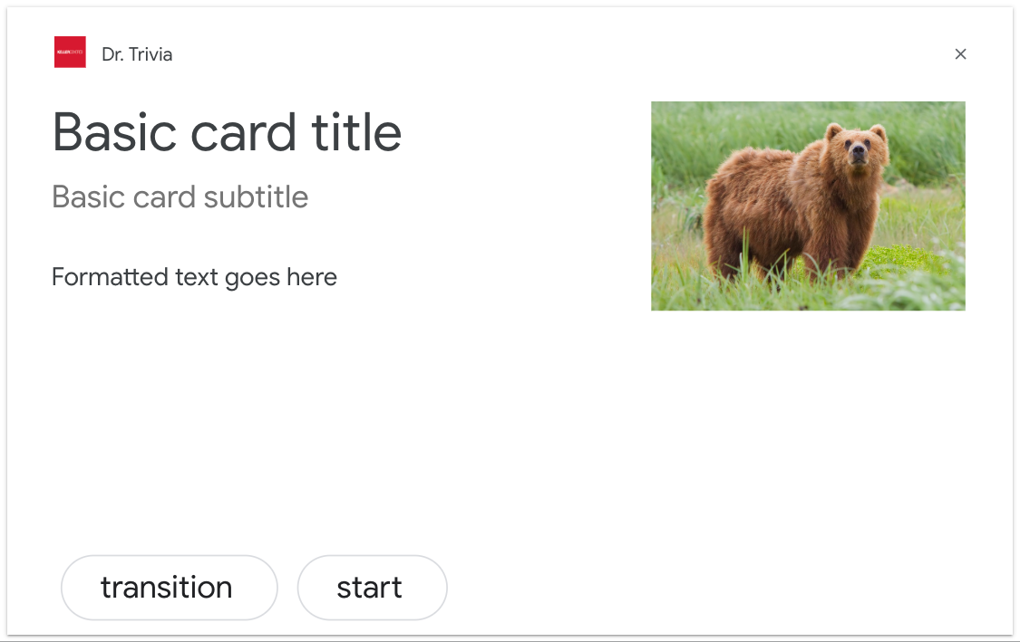
A card on a smart display.
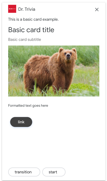
A card on a smartphone.
meya.cards
Supported surfaces: phone.
A browsing carousel is a rich response that allows users to scroll vertically and select a tile in a collection. Browsing carousels are designed specifically for web content by opening the selected tile in a web browser. The browsing carousel will also persist on the user's surface for browsing later.
The meya.table and meya.list components can also be used to display a collection of items.
Ameya.textcomponent must be placed immediately before ameya.cardscomponent.
Property | Description | |
|---|---|---|
| A list of | Required |
| Automatically advance without waiting for the user's response. |
|
| Treat any non-button press as a user input. This will trigger the |
|
| The key used to store the data for subsequent steps in the flow. |
|
| Where to store the data. One of |
|
All cards in the carousel must have the same components. For example, if one card has an image, all of the cards must have an image.
If you wish to display cards without any buttons, you'll need to ensure passthru is true and expect_user_action is false. See the Without buttons code example below.
# supported: phone
states:
    # meya.text is required before meya.cards
    browsing_carousel_0:
        component: meya.text
        properties:
            text: This is a browse carousel example.
    browsing_carousel_1:
        component: meya.cards
        properties:
            passthru: true
            expect_user_action: false
            output: button_click
            elements:
                - title: "Title of item 1"
                  text: "Description of item 1"
                  item_url: "https://www.google.com/"
                  image_url: "https://upload.wikimedia.org/wikipedia/commons/thumb/5/53/Google_%22G%22_Logo.svg/2560px-Google_%22G%22_Logo.svg.png"
                  footer: "Item 1 footer"
                  buttons:
                    - text: Link
                      url: "https://en.wikipedia.org"
                    - text: Transition1
                      action: next
                - title: "Google Assistant"
                  text: "Google Assistant on Android and iOS"
                  item_url: "https://meya.ai/"
                  image_url: "https://upload.wikimedia.org/wikipedia/en/2/2c/Google_Actions_Logo.png"
                  footer: "Item 2 footer"
                  buttons:
                    - text: Transition2
                      action: next
    browsing_carousel_2:
        component: meya.text
        properties:
            text: The next state {{ flow.button_click }}
component: meya.cards
properties:
output: button_click
passthru: true
expect_user_action: false
elements:
- title: "Basic card title"
text: "Formatted text goes here"
image_url: "http://i.imgur.com/7Z9IX5W.jpg"
accessibility_text: "An African elephant"
footer: "This is some footer text"
- title: "Basic card title"
text: "Formatted text goes here"
image_url: "http://i.imgur.com/w5qzZ7I.jpg"
accessibility_text: "An Asian elephant"
footer: "This is some footer text"Here is an example of how to construct a card programmatically.
# -*- coding: utf-8 -*-
from meya import Component
from meya.cards import Card, Cards, Button


class HelloWorld(Component):

    def start(self):
        cards = Cards(
            elements=[
                Card(
                    title='My Title 1',
                    subtitle='My subtitle 1',
                    text='Some text 1',
                    item_url='https://en.wikipedia.org/wiki/African_elephant',
                    footer='Item 1 footer',
                    image_url='http://i.imgur.com/7Z9IX5W.jpg',
                    accessibility_text='An image',
                    buttons=[Button(text='Cool!', action='next')]
                ),
                Card(
                    title='My Title 2',
                    subtitle='My subtitle 2',
                    text='Some text 2',
                    item_url='https://en.wikipedia.org/wiki/Asian_elephant',
                    footer='Item 2 footer',
                    image_url='http://i.imgur.com/w5qzZ7I.jpg',
                    accessibility_text='An image',
                    buttons=[Button(text='Awesome!', action='next')]
                )
            ]
        )

        # A basic text message is required before a card.
        messages = [
            self.create_message(text='Here is a multi card...'),
            self.create_message(card=cards)
        ]
        return self.respond(messages=messages)
states:
first:
component: py_cards
properties:
expect_user_action: true
transitions:
next: done
done:
component: meya.text
properties:
text: "All done!"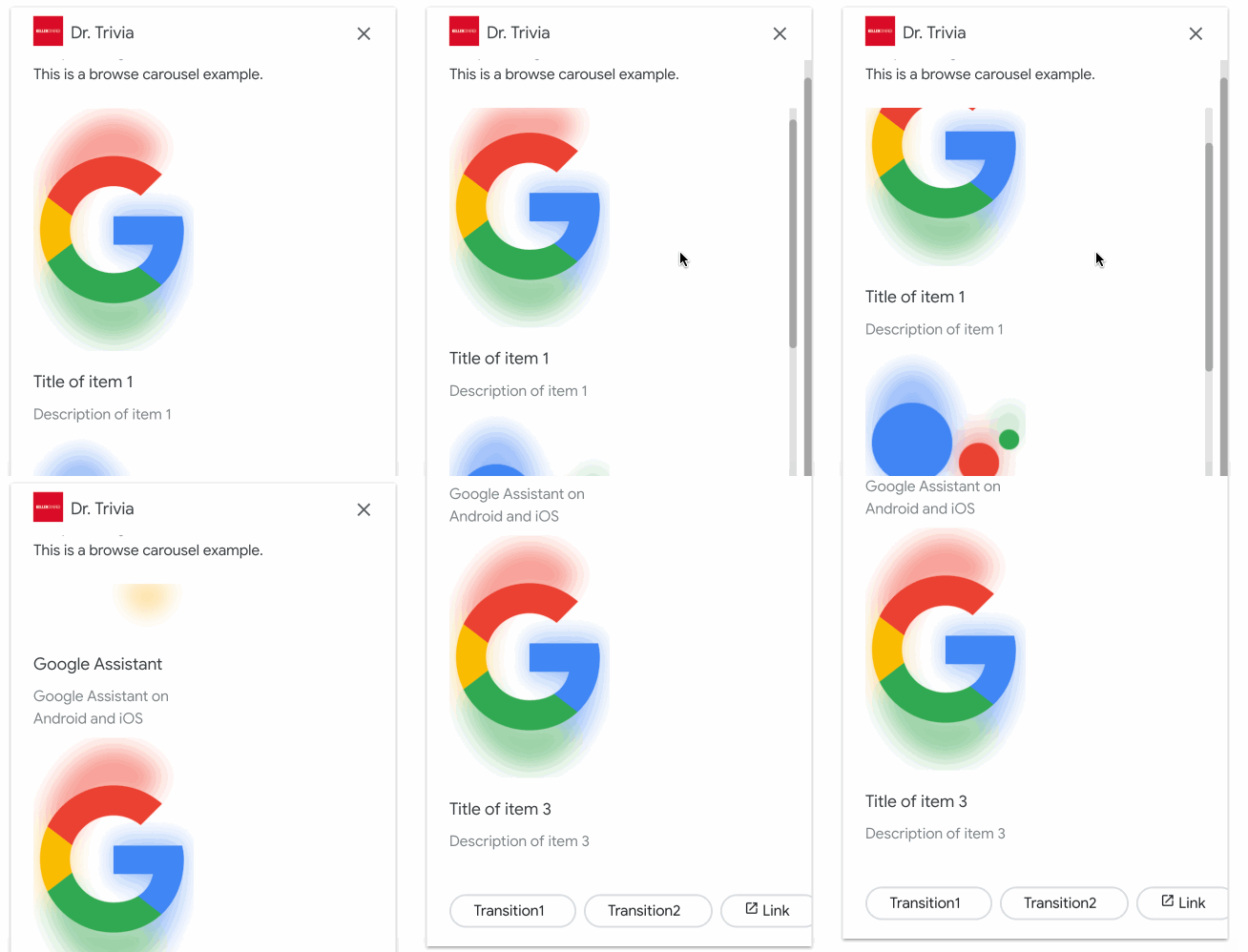
A browsing carousel on a smartphone.
meya.image
Supported surfaces: phone, smart display.
Displays an image specified by the image_url.
Property | Description | |
|---|---|---|
| The URL of the image to display. | Required |
| A description of the image. |
|
| One of |
|
Here is an example image card.
component: meya.image
properties:
    image_url: "https://upload.wikimedia.org/wikipedia/commons/c/c1/Lionel_Messi_20180626.jpg"
    accessibility_text: "Messi photo"
    image_display_options: "WHITE"
Here is an example of how to construct a card programmatically.
# -*- coding: utf-8 -*-
from meya import Component
from meya.cards import Image


class HelloWorld(Component):

    def start(self):
        # Max of one button. Button must be a link, not transition.
        card = Image(
            image_url='https://upload.wikimedia.org/wikipedia/commons/7/71/2010-kodiak-bear-1.jpg',
            accessibility_text='An image'
        )

        # A basic text message is required before a card.
        messages = [
            self.create_message(text='Here is an image card...'),
            self.create_message(card=card)
        ]
        return self.respond(messages=messages, action='next')
states:
first:
component: py_image
done:
component: meya.text
properties:
text: "All done!"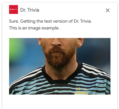
meya.image_buttons
Supported surfaces: phone, smart display.
Displays an image and suggestions chips.
Property | Description | |
|---|---|---|
| The URL of the image to output. | Required |
| A description of the image. |
|
| One of |
|
| A list of buttons displayed as suggestion chips. | Optional |
| Automatically advance without waiting for the user's response. |
|
| Tells the Actions on Google device to expect a response from the user. |
|
Here's an example of an image card with buttons.
basic_card_1:
    component: meya.image_buttons
    properties:
        image_url: "https://upload.wikimedia.org/wikipedia/commons/7/71/2010-kodiak-bear-1.jpg"
        accessibility_text: "bear photo"
        image_display_options: "CROPPED"
        output: button_click
        buttons:
            - text: transition
              action: button_action
              data:
                foo: bar
            - text: link
              url: https://meya.ai
            - text: start
              action: subflow
    transitions:
        button_action: basic_card_2
        subflow: basic_card_3
Here is an example of how to construct a card programmatically.
# -*- coding: utf-8 -*-
from meya import Component
from meya.cards import ImageWithButtons, Button


class HelloWorld(Component):

    def start(self):
        # Max of one button. Button must be a link, not transition.
        card = ImageWithButtons(
            image_url='https://upload.wikimedia.org/wikipedia/commons/7/71/2010-kodiak-bear-1.jpg',
            accessibility_text='An image',
            passthru=False,
            buttons=[
                Button(text='Done', action='next'),
                Button(
                    text='Link',
                    url='https://upload.wikimedia.org/wikipedia/commons/7/71/2010-kodiak-bear-1.jpg'
                ),
            ]
        )

        # A basic text message is required before a card.
        messages = [
            self.create_message(text='Here is an image card with buttons...'),
            self.create_message(card=card)
        ]
        return self.respond(messages=messages)
states:
first:
component: py_imagebuttons
properties:
expect_user_action: true # Must be true
transitions:
next: done
done:
component: meya.text
properties:
text: "All done!"
An image with buttons on a smart display.
meya.image_suggestions
Supported surfaces: phone, smart display.
Displays an image and suggestions chips.
Property | Description | |
|---|---|---|
| The URL of the image to output. | Required |
| A description of the image. |
|
| One of |
|
| A list of suggestions rendered as suggestion chips. | Optional |
| Automatically advance without waiting for the user's response. |
|
| Tells the Actions on Google device to expect a response from the user. |
|
Here's an example of an image card with suggestions.
basic_card_1:
    component: meya.image_buttons
    properties:
        image_url: "https://upload.wikimedia.org/wikipedia/commons/7/71/2010-kodiak-bear-1.jpg"
        accessibility_text: "bear photo"
        image_display_options: "CROPPED"
        output: button_click
        suggestions:
            - suggestion_1
            - suggestion_2
    transitions:
        suggestion_1: text_suggestions_1
        suggestion_2: text_suggestions_2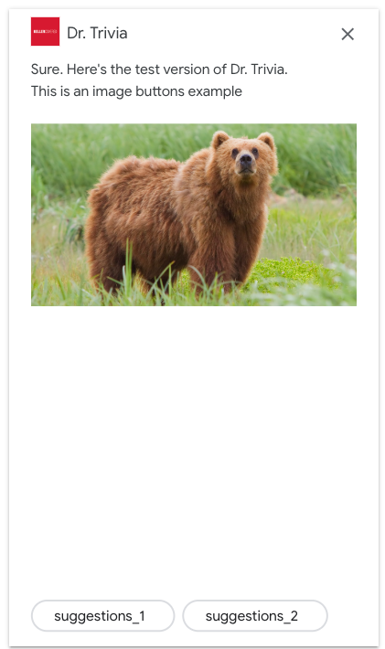
An image with suggestions on a phone.
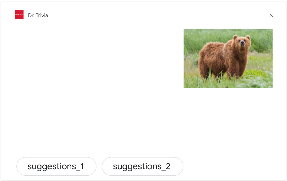
An image with suggestions on a smart display.
meya.text_buttons
Supported surfaces: phone, smart display.
Displays text and suggestions chips.
Property | Description | |
|---|---|---|
| The text to output. |
|
| A list of buttons rendered as suggestion chips. | Required |
| Automatically advance without waiting for the user's response. |
|
| Treat any non-button press as a user input. This will trigger the |
|
| The key used to store the data for subsequent steps in the flow. |
|
| Where to store the data. One of |
|
Here is an example of a text card with buttons.
text_buttons_0:
    component: meya.text_buttons
    properties:
        text: text buttons test
        output: button_click
        buttons:
            - text: transition
              action: next
            - text: transition2
              action: next
            - text: link
              url: https://meya.ai
Here is an example of how to construct a card programmatically.
# -*- coding: utf-8 -*-
from meya import Component
from meya.cards import TextWithButtons, Button


class HelloWorld(Component):

    def start(self):
        # Max of one button. Button must be a link, not transition.
        card = TextWithButtons(
            text='Some text',
            passthru=False,
            buttons=[
                Button(text='Done', action='next'),
                Button(
                    text='Link',
                    url='https://upload.wikimedia.org/wikipedia/commons/7/71/2010-kodiak-bear-1.jpg'
                ),
            ]
        )

        # A basic text message is required before a card.
        messages = [
            self.create_message(text='Here is a text card with buttons...'),
            self.create_message(card=card)
        ]
        return self.respond(messages=messages)
states:
first:
component: py_textbuttons
properties:
expect_user_action: true # Must be true
transitions:
next: done
done:
component: meya.text
properties:
text: "All done!"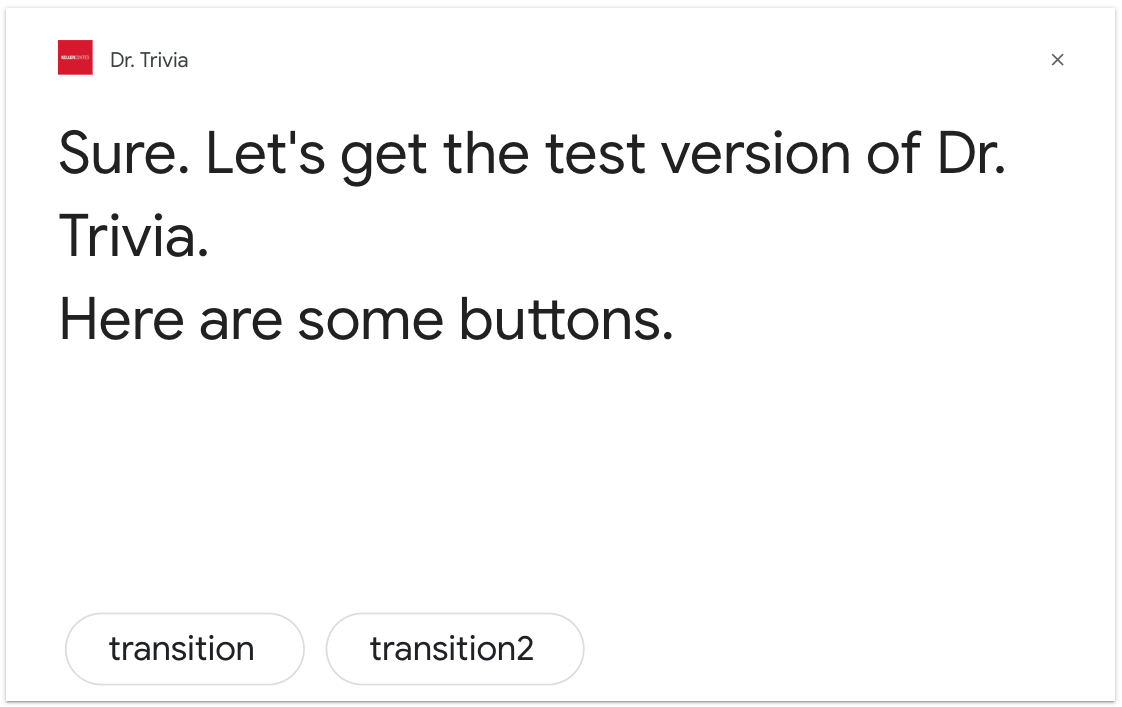
A text card with buttons.
meya.text_suggestions
Supported surfaces: phone, smart display.
Displays text and suggestions chips.
Property | Description | |
|---|---|---|
| The text to display. |
|
| A list of suggestions displayed as suggestions chips. | Required |
Here is an example of a text card with suggestions.
# supported: phone, smart display
triggers:
  - type: meya.keyword
    properties:
        ignorecase: true
        keyword: text_suggestions
states:
    text_suggestions_0:
        component: meya.text_suggestions
        properties:
            text: text suggestions test
            suggestions:
                - suggestion_1
                - suggestion_2
        transitions:
            suggestion_1: text_suggestions_1
            suggestion_2: text_suggestions_2
    text_suggestions_1:
        component: meya.text
        properties:
            text: Suggestion 1
        return: true
    text_suggestions_2:
        component: meya.text
        properties:
            text: Suggestion 2
        return: true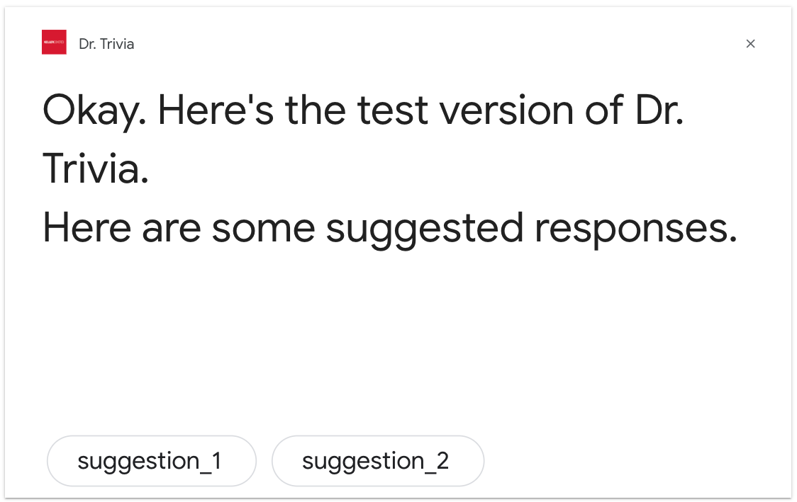
Text suggestions on a smart display.
meya.list
Supported surfaces: phone, smart display. For speakers, the list/carousel card itself will be skipped.
The meya.list component has two modes: list, and carousel.
List
The single-select list presents the user with a vertical list of multiple items and allows the user to select a single one. Selecting an item from the list generates a user query (chat bubble) containing the title of the list item.
Carousel
The carousel scrolls horizontally and allows for selecting one item. Compared to the list selector, it has large tiles-allowing for richer content. The tiles that make up a carousel are similar to the basic card with an image. Selecting an item from the carousel will generate a chat bubble as the response just like list mode.
The meya.table and meya.cards components can also be used to display a collection of items.
Property | Description | |
|---|---|---|
| A title for the entire list. Must be no more than 1 line. Extra characters will be truncated. Not used if | Optional |
| If |
|
| A variable name where the item click will be stored. |
|
| One of |
|
| A list of items. See the table below for more details. | Required |
| A list of buttons displayed as suggestion chips. | Optional |
Each entry in the list has the following properties.
Property | Description | |
|---|---|---|
| The title of the item must be unique and no more than one line. Extra characters will be truncated. | Required |
| A description of the item. It must be no more than 2 lines. Extra characters will be truncated. | Optional |
| An image of the item. | Optional |
| A description of the image. |
|
| A list of buttons displayed as suggestion chips. Although defined as a list of buttons, the list may contain only one button. The button must be a transition button. | Optional |
Here are two examples of a list and a carousel.
list_1:
    component: meya.list
    properties:
        title: "My list"
        output: option_selected
        elements:
            - title: "Title 1"
              subtitle: "Subtitle 1"
              image_url: "https://image.shutterstock.com/image-photo/robotic-artificial-intelligence-robo-advisor-600w-664114771.jpg"
              # only 1 transition button allowed
              buttons:
                - text: "Button 1"
                  action: selection
            - title: "Title 2"
              subtitle: "Subtitle 2"
              image_url: "https://image.shutterstock.com/image-photo/moscow-russia-october-16-2017-600w-754222927.jpg"
              buttons:
                - text: "Button 2"
                  action: selection
            - title: "Title 3"
              subtitle: "Subtitle 3"
              image_url: "https://image.shutterstock.com/image-photo/concept-artificial-brain-robot-composed-600w-261598403.jpg"
              buttons:
                - text: "Button 3"
                  action: selection
        # optional suggestion chips
        buttons:
            - text: "A transition button"
              action: suggestion
            - text: "A link button"
              url: https://meya.ai
    transitions:
        suggestion: list_2
        selection: list_3
list_1:
component: meya.list
properties:
carousel: true
output: option_selected
elements:
- title: "Title 1"
subtitle: "Subtitle 1"
image_url: "https://image.shutterstock.com/image-photo/robotic-artificial-intelligence-robo-advisor-600w-664114771.jpg"
# only 1 transition button per item is allowed
buttons:
- text: "Button 1"
action: selection
- title: "Title 2"
subtitle: "Subtitle 2"
image_url: "https://image.shutterstock.com/image-photo/moscow-russia-october-16-2017-600w-754222927.jpg"
buttons:
- text: "Button 2"
action: selection
- title: "Title 3"
subtitle: "Subtitle 3"
image_url: "https://image.shutterstock.com/image-photo/concept-artificial-brain-robot-composed-600w-261598403.jpg"
buttons:
- text: "Button 3"
action: selection
# optional suggestion chips
buttons:
- text: "A transition button"
action: suggestion
- text: "A link button"
url: https://meya.ai
transitions:
suggestion: list_2
selection: list_3# -*- coding: utf-8 -*-
from meya import Component
from meya.cards import List, Element, Button
class HelloWorld(Component):
def start(self):
elements = [
Element(
title="Robot 1",
subtitle="It's a hand",
image_url="https://image.shutterstock.com/image-photo/robotic-artificial-intelligence-robo-advisor-600w-664114771.jpg",
buttons=[Button(text="robot1", action="next")]
),
Element(
title="Robot 2",
subtitle="It's a hand",
image_url="https://image.shutterstock.com/image-photo/moscow-russia-october-16-2017-600w-754222927.jpg",
buttons=[Button(text="robot2", action="next")]
),
Element(
title="Robot 3",
subtitle="It's a hand",
image_url="https://image.shutterstock.com/image-photo/concept-artificial-brain-robot-composed-600w-261598403.jpg",
buttons=[Button(text="robot3", action="next")]
),
]
card = List(
title="mytitle",
elements=elements,
top_element_style="compact",
buttons=[Button(text="done", action="next")]
)
# Note that a text message must precede a list.
messages = [
self.create_message(text='Here is a list...'),
self.create_message(card=card)
]
return self.respond(messages=messages)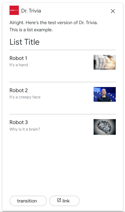
A list on a smartphone.
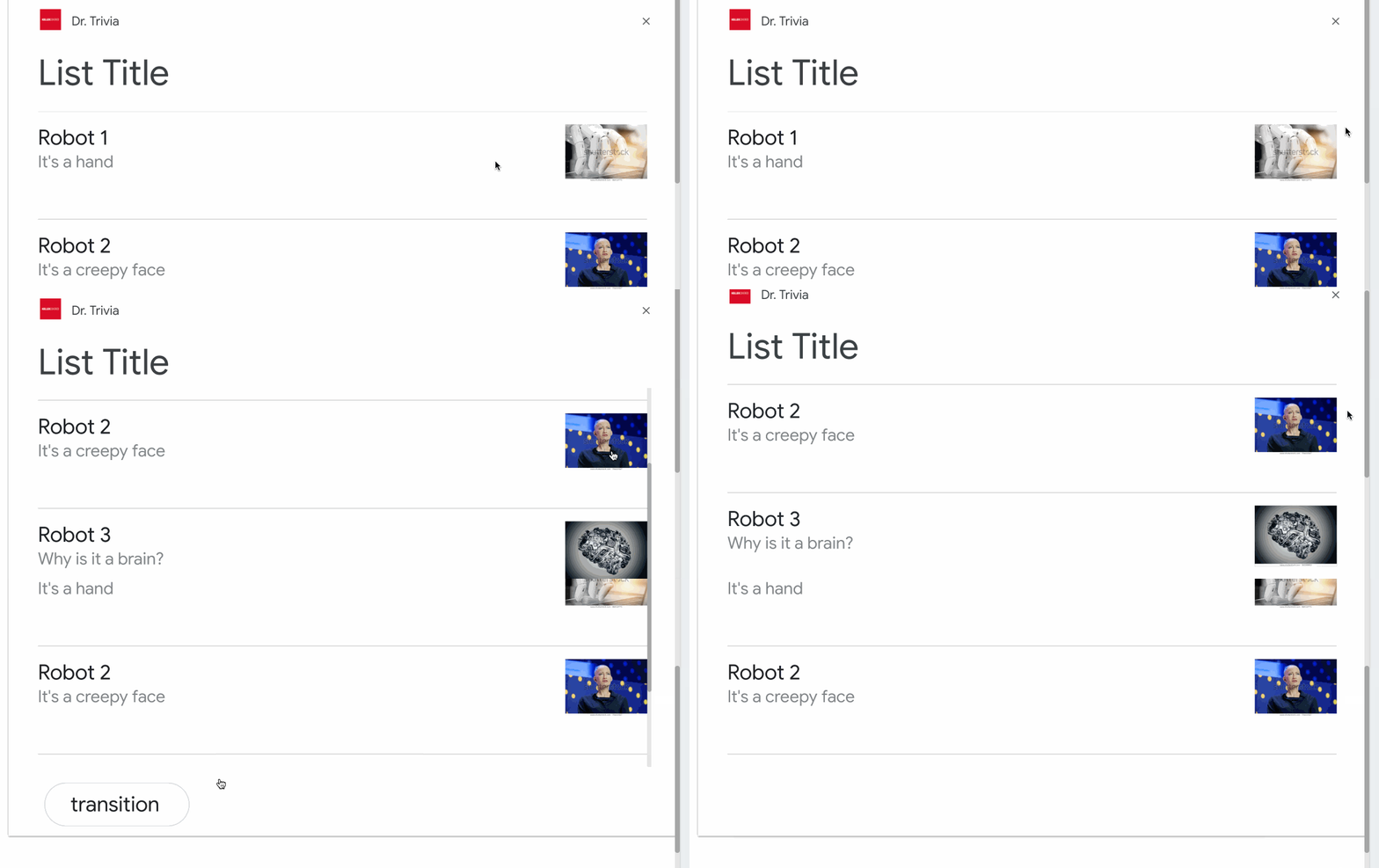
A list on a smart display.
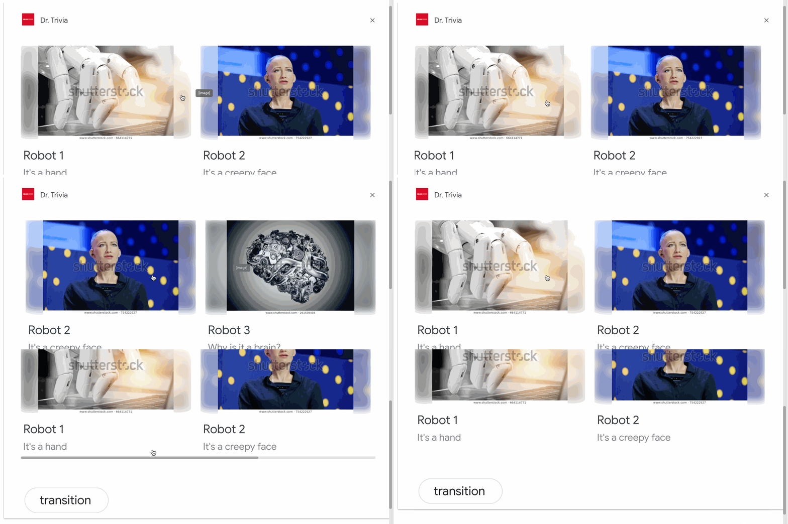
A carousel on a smart display.
meya.table
Supported surfaces: phone, smart display. For speakers, the table card itself will be skipped.
Table cards allow you to display tabular data in your response (for example, sports standings, election results, and flights). You can define columns and rows (up to 3 each) that the Assistant is required to show in your table card. You can also define additional columns and rows along with their prioritization.
Table cells display static data and are non-interactive. You may add suggestion chips to the table itself to create interactivity.
The meya.cards and meya.list components can also be used to display a collection of items.
Property | Description | |
|---|---|---|
| The title of the table. | Optional |
| The subtitle of the table. | Optional |
| An image associated with the table. | Optional |
| A description of the image. |
|
| A list of buttons displayed as suggestion chips. | Optional |
| A list of column headers and other column attributes. See column properties below. | Optional |
| A list of See cell properties below. | Required |
| Automatically advance without waiting for the user's response. |
|
| Tells the Actions on Google device to expect a response from the user. |
|
Each entry in columns has the following properties.
Property | Description | |
|---|---|---|
| The header text for the column. | Optional |
| One of |
|
Each entry in rows has the following properties.
Property | Description | |
|---|---|---|
| A list of cells in the row. | Required |
| Whether or not a dividing line should appear after the row. |
|
Each entry in cells has the following property.
Property | Description | |
|---|---|---|
| The text to display. | Required |
If you wish to display a table without any buttons, you'll need to ensure passthru is true and expect_user_action is false. See the Without buttons code example below.
table_1:
    component: meya.table
    properties:
        title: "Table title"
        subtitle: "Table subtitle"   # title must be set first
        image_url: "https://developers.google.com/actions/images/badges/XPM_BADGING_GoogleAssistant_VER.png"
        accessibility_text: "Alt Text"
        columns:
            - header: "header 1"
            - header: "header 2"
              alignment: "CENTER"
            - header: "header 3"
              alignment: "TRAILING"
        rows:
            - cells:
                - text: "row 1 item 1"
                - text: "row 1 item 2"
                - text: "row 1 item 3"
            - cells:
                - text: "row 2 item 1"
                - text: "row 2 item 2"
                - text: "row 2 item 3"
              divider: true
            - cells:
                - text: "row 3 item 1"
                - text: "row 3 item 2"
                - text: "row 4 item 3"
              divider: false
        buttons:
            # appears as a suggestion chip
            - text: transition
              action: next
              data:
                foo: bar
            # appears as link button on tablet
            # supported: phone
            - text: link
              url: https://meya.ai
table_1:
component: meya.table
properties:
title: "Table title"
subtitle: "Table subtitle" # title must be set first
image_url: "https://developers.google.com/actions/images/badges/XPM_BADGING_GoogleAssistant_VER.png"
accessibility_text: "Alt Text"
columns:
- header: "header 1"
- header: "header 2"
alignment: "CENTER" # CENTER, LEADING (default), TRAILING
- header: "header 3"
alignment: "TRAILING"
rows:
- cells:
- text: "row 1 item 1"
- text: "row 1 item 2"
- text: "row 1 item 3"
- cells:
- text: "row 2 item 1"
- text: "row 2 item 2"
- text: "row 2 item 3"
divider: true
- cells:
- text: "row 3 item 1"
- text: "row 3 item 2"
- text: "row 4 item 3"
divider: false
passthru: true
expect_user_action: falseHere is an example of how to construct a card programmatically.
# -*- coding: utf-8 -*-
from meya import Component
from meya.cards import Card, Button


class HelloWorld(Component):

    def start(self):
        card = Card(
            title='Table Title',
            subtitle='Table subtitle',
            is_table=True,
            passthru=False,
            columns=[
                {'header': 'Header 1'},
                {'header': 'Header 2', 'alignment': 'CENTER'},
                {'header': 'Header 3', 'alignment': 'TRAILING'},
            ],
            rows=[
                {
                    'cells': [
                        {'text': 'row 1 item 1'},
                        {'text': 'row 1 item 2'},
                        {'text': 'row 1 item 3'},
                    ]
                },
                {
                    'cells': [
                        {'text': 'row 1 item 1'},
                        {'text': 'row 1 item 2'},
                        {'text': 'row 1 item 3'},
                    ],
                    'divider': True
                },
                {
                    'cells': [
                        {'text': 'row 1 item 1'},
                        {'text': 'row 1 item 2'},
                        {'text': 'row 1 item 3'},
                    ],
                    'divider': False
                },
            ],
            # Only one button is allowed.
            buttons=[Button(text='Done', action='next')]
        )

        # A basic text message is required before a card.
        messages = [
            self.create_message(text='Here is a basic card...'),
            self.create_message(card=card)
        ]
        return self.respond(messages=messages)
states:
first:
component: py_table
properties:
expect_user_action: true # Must be true
transitions:
next: done
done:
component: meya.text
properties:
text: "All done!"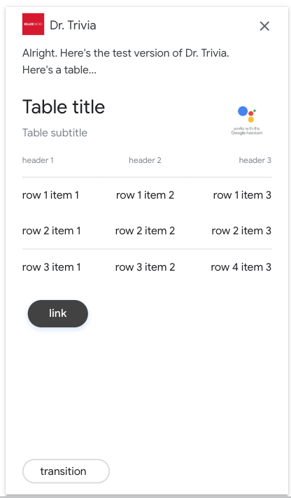
A table with a suggestion chip on a phone.
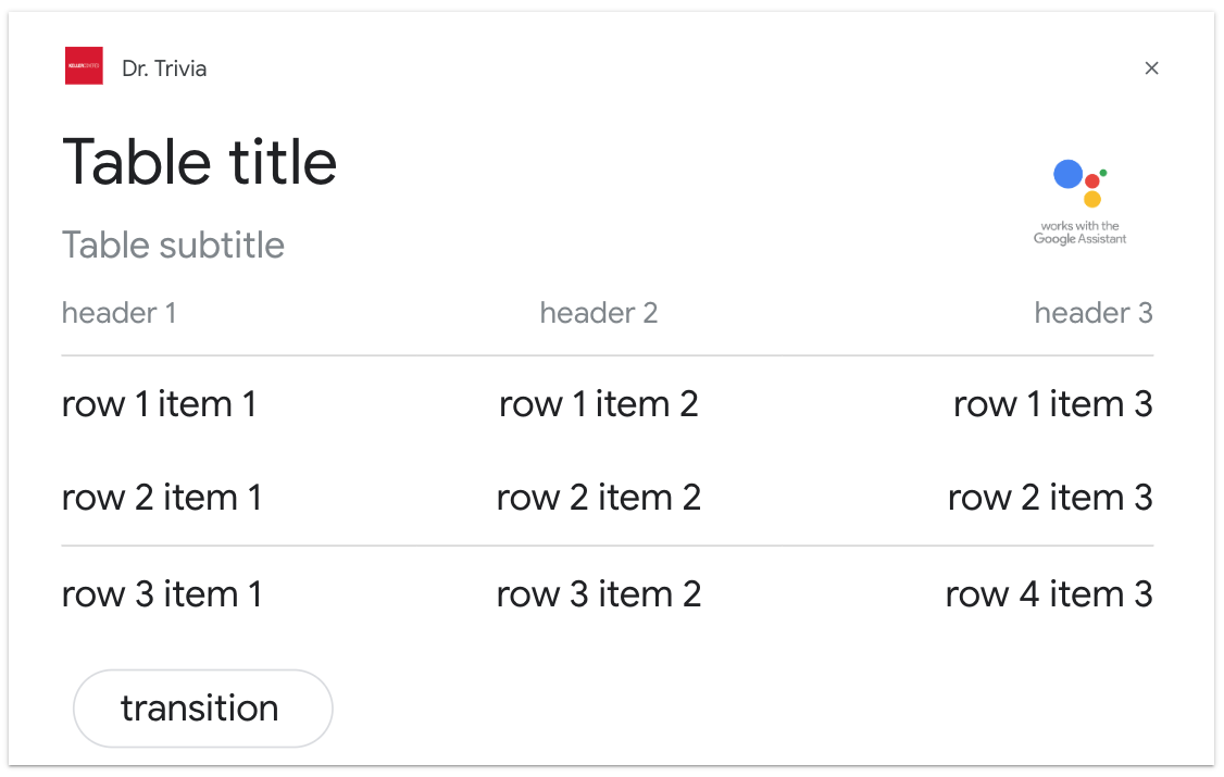
A table with a suggestion chip on a smart display.
meya.audio
Supported surfaces: phone, speaker, smart display.
Displays audio content. The card contains audio controls (e.g. play, pause, rewind).
Property | Description | |
|---|---|---|
| The URL of the audio to play. The URL must use HTTPS. The audio file must be an | Required |
| The name of the audio file. | Optional |
| A description of the audio file. | Optional |
| The image should be 36 x 36 px. Larger images are resized to fit. GIFs are allowed. | Optional |
| A description of the icon image. |
|
Here's an example of an audio card.
states:
    # meya.text required before meya.audio
    audio_0:
        component: meya.text
        properties:
            text: "This is a media response example."
    audio_1:
        component: meya.audio
        properties:
            url: "https://storage.googleapis.com/automotive-media/Jazz_In_Paris.mp3"
            accessibility_text: "Ocean view"
            icon_url: "https://storage.googleapis.com/automotive-media/album_art.jpg"
            description: "A funky Jazz tune"
            name: "Jazz in Paris"
Here is an example of how to construct a card programmatically.
# -*- coding: utf-8 -*-
from meya import Component
from meya.cards import Audio


class HelloWorld(Component):

    def start(self):
        card = Audio(
            url='https://storage.googleapis.com/automotive-media'
                '/Jazz_In_Paris.mp3',
            accessibility_text='Ocean view',
            icon_url='https://storage.googleapis.com/automotive-media'
                     '/album_art.jpg',
            description='A funky Jazz tune',
            name='Jazz in Paris'
        )

        # A basic text message is required before a card.
        messages = [
            self.create_message(text='Here is an audio card...'),
            self.create_message(card=card)
        ]
        return self.respond(messages=messages, action='next')
states:
first:
component: py_audio
Themeya.audiocomponent must be preceded by ameya.textcomponent.
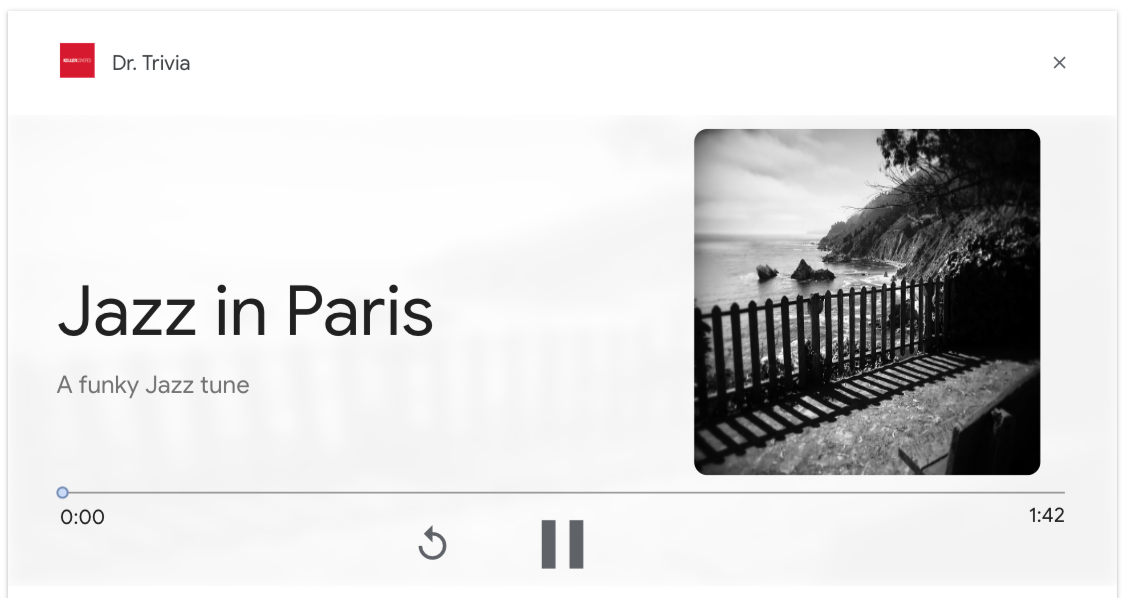
An audio card.
meya.input_location
Supported surfaces: phone, speaker, smart display.
Have the Google Assistant ask the user for permission to access their coarse or precise location.
Requesting coarse permission will add the following fields to the user's user DB:
citypostal_code
Requesting precise permission will add the following fields to the user's user DB:
citystatecountrypostal_codelatlngtimezone
Meya uses a standard naming convention for location properties. Location data returned from Google is re-mapped to conform to this standard. For example, zipCode is mapped to postal_code, coordinates.latitude is mapped to lat. The raw location data returned by Google can be found in its unaltered form at user._location.
Property | Description | |
|---|---|---|
| The text to display to the user. | |
| Text to speak to the user. This field also accepts SSML markup to customize pronunciation. | Optional |
| One of | Optional. Default: |
| The beginning of a phrase the Google Assistant will display to the user. It should explain why you need the user's location. The phrase has this format: Note that only the beginning of the phrase can be altered, so it's important to set | Optional. Default: |
| The key used to store the data entered by the user. | Default: |
| The assumed confidence when matching. | Optional. Default: |
| If | Optional. Default: |
| A message sent to the user if the input was not a location. Error messages are only shown if Note: the Google Assistant will handle non-location responses by itself and reprompt the user. You only need to set an | Optional. Default: |
| If | Optional. Default: |
The data is stored to the user scope DB. You can access the information found in the table below.
Datastore | Description | Permission required |
|---|---|---|
| The postal code or zip code of the location. |
|
| The city of the location. |
|
| The country of the location. |
|
| The latitude of the location. |
|
| The longitude of the location. |
|
| The timezone of the location. |
|
| The state or province of the location. |
|
Here are three examples of a meya.input_location component.
states:
    # For Actions on Google, it's recommended to have `require_match` set to
    # `false` so that you can handle the case where the user declines to give
    # location permssions.
    input_location_state:
        component: meya.input_location
        properties:
            text: "Where are you?"
            require_match: false
            precision: coarse
            opt_context: "To recommend stores near you" # Optional
        transitions:
            next: done
            no_match: no_match
    no_match:
        component: meya.text
        properties:
            text: "I couldn't find your location."
        return: true
    done:
        component: meya.text
        properties:
            text: "Your zip code/postal code is: {{ user.postal_code }}"
states:
# For Actions on Google, it's recommended to have `require_match` set to
# `false` so that you can handle the case where the user declines to give
# location permssions.
input_location_state:
component: meya.input_location
properties:
text: "Where are you?"
require_match: false
# precision: precise # Optional, since default is `precise`
opt_context: "To ship your order" # Optional
transitions:
next: done
no_match: no_match
no_match:
component: meya.text
properties:
text: "I couldn't find your location."
return: true
done:
component: meya.text
properties:
text: "You lat/lng is ({{ user.lat }}, {{ user.lng }})"states:
# When `require_match` is set to `true` (which is the default), the bot will
# reply with a standard error message instead of accepting a `no_match`
# intent.
input_location_state:
component: meya.input_location
properties:
text: "Where are you?"
precision: precise # Optional, since default is `precise`
opt_context: "To ship your order" # Optional
# The user will only reach this state if they enter a valid location.
done:
component: meya.text
properties:
text: " Your lat/lng is: ({{ user.lat }}, {{ user.lng }})"Updated 11 months ago
