
Get basic text input from the user using a form text input. This component
is similar to the text.ask.form component
but can also be used as a text input widget in a page.
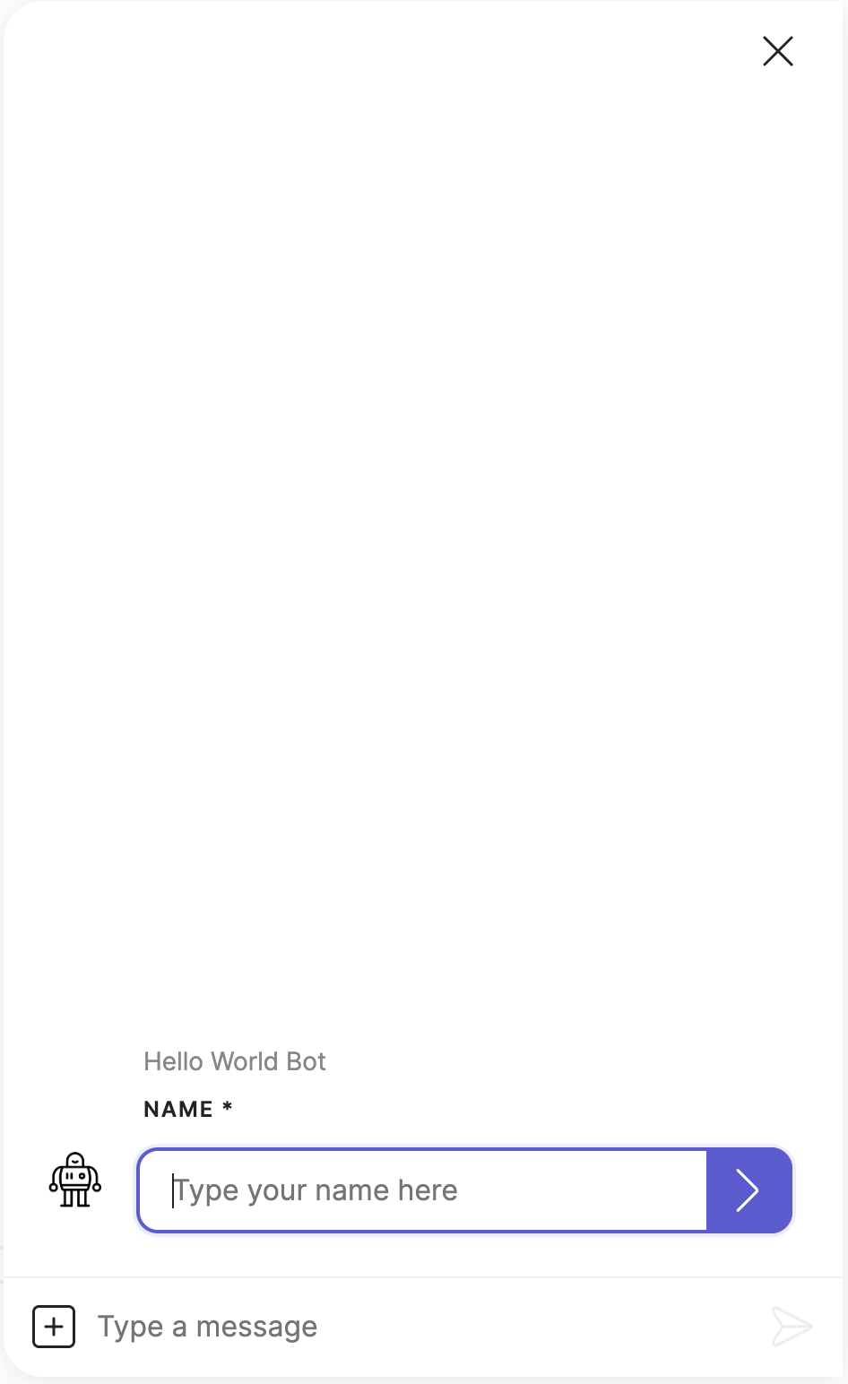
- type: meya.text.component.input
  label: What is your name?
  required: true
  placeholder: Type your name here
Which produces the following in the Meya Orb Web SDK client:
The text input component is also an interactive component which allows you to set
quick replies, configure the input composer
and set context data.
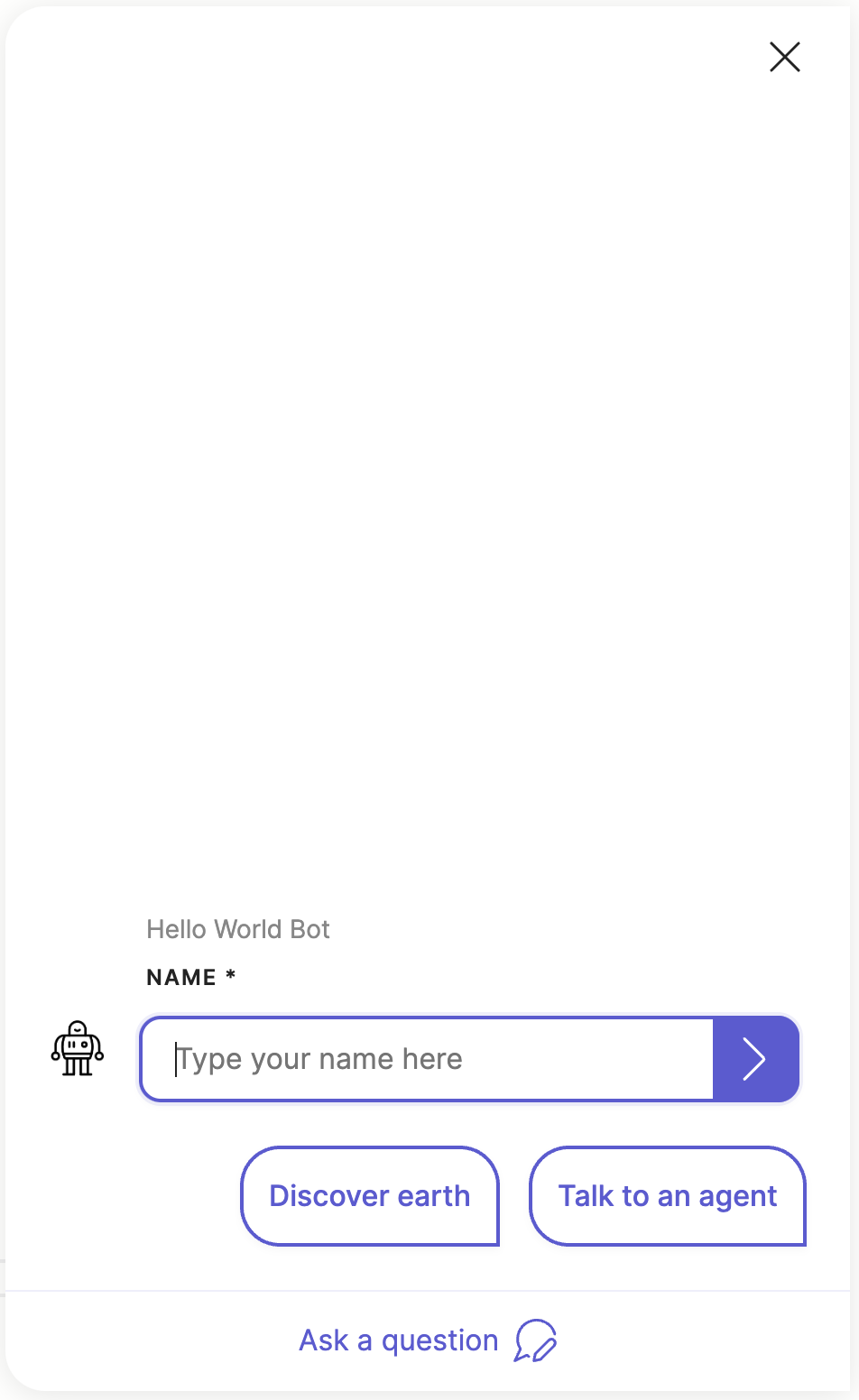
Here is a more advanced example:
- type: meya.text.component.input
  label: Name
  required: true
  placeholder: Type your name here
  quick_replies:
    - text: Discover earth
      action:
        flow: flow.earth
    - text: Talk to an agent
      action:
        flow: flow.agent
  context:
    foo: bar
  composer:
    focus: blur
    visibility: collapse
    collapse_placeholder: Ask a question
Which produces the following output:
Note, not all integrations support the quick_replies and composer
fields. Check the compatibility matrix
and integration documentation to see which features the specific integration
you are using supports.
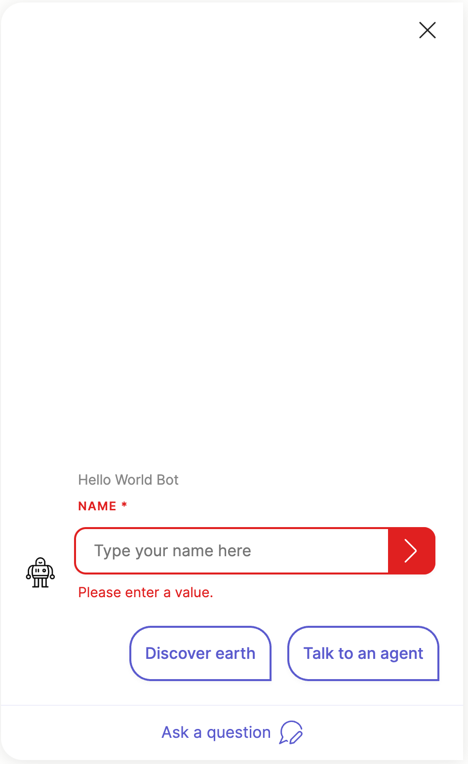
Input validation
The text input component has no specific input validation and will capture any
text input submitted by the user. However, if the required field is set
to true then the input component will display an error if the user
submits no value.
Here is an example of the error:
The user's input text is always stored in (@ flow.result ) in your app's
flow scope data.
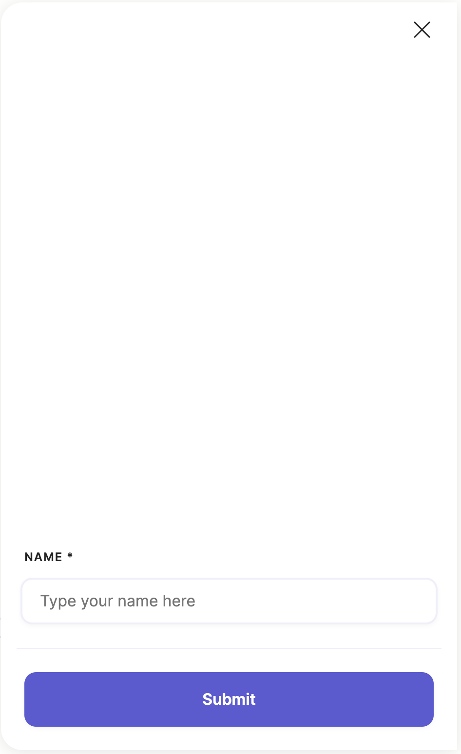
Pages support
This text input component is also a widget component that can be displayed as a field
in a page.
Here is an example using the text input component in a page:
- page:
  - type: meya.text.component.input
    label: Name
    required: true
    placeholder: Type your name here
Which produces the following output:
Check the Widgets & Pages guide for more info on creating advanced
form wizards for collecting user input.
Element details
type: meya.text.component.input
class: TextInputComponent
path: /meya/text/component/input/input.py
signature: -
Fields
| field | description | required | signature | default | type |
|---|---|---|---|---|---|
| spec | Override the original spec for this element. | ○ | ○ | null | Spec |
| context | Send context data with this component's event. | ○ | ○ | {} | dict |
| sensitive | Mark this component's event as sensitive. This will encrypt the event if the Sensitive Data integration has been enabled. | ○ | ○ | false | bool |
| triggers | Activate these dynamic triggers when the component runs. Check the component triggers guide for more info. | ○ | ○ | [] | list |
| quick_replies | List of buttons that the user can select for replies. | ○ | ○ | [] | list |
| composer | The composer spec that allows you to control the Orb's input composer. Check the Composer guide for more info. | ○ | ○ | focus: blur placeholder: collapse_placeholder: visibility: character_limit: | ComposerElementSpec |
| header | Override the header for this component. | ○ | ○ | buttons: title: progress: milestones: extra_buttons: | HeaderElementSpec |
| markdown | Override the bot Markdown mode for this component. Check the Markdown guide for more info. | ○ | ○ | null | list bool NoneType |
| required | ○ | ○ | false | bool | |
| label | ○ | ○ | null | str | |
| disabled | ○ | ○ | false | bool | |
| icon | The icon spec or URL to use for the input field. See the Icons guide for more info. | ○ | ○ | null | IconElementSpec str NoneType |
| placeholder | The input field's placeholder text. This is displayed when thefield has not user specified text. | ○ | ○ | null | str |
| default | The input's default value. | ○ | ○ | null | str |
| error_message | ○ | ○ | "Please enter a value." | str | |
Usage reference
Basic
triggers:
  - keyword: meya.text.component.input
steps:
  - type: meya.text.component.input
Full
triggers:
  - keyword: meya.text.component.input
steps:
  - type: meya.text.component.input
    spec:
      type: STRING
      data:
        STRING: ANY
      timeout: 123
      trigger_when: ANY
    context:
      STRING: ANY
    sensitive: false
    triggers:
      - type: STRING
        data:
          STRING: ANY
        timeout: 123
        trigger_when: ANY
    quick_replies:
      - url: STRING
        javascript: STRING
        button_id: STRING
        context:
          STRING: ANY
        default: false
        disabled: false
        divider: false
        icon:
          url: STRING
          color: STRING
          path: STRING
        action: COMPONENT
        value: ANY
        result: ANY
        data:
          STRING: ANY
        magic: false
        type: text|url|static|menu|divider|action|flow_next|component_next
        menu:
          - BUTTONELEMENTSPEC
        text: STRING
    composer:
      focus: file|image|text|blur
      placeholder: STRING
      collapse_placeholder: STRING
      visibility: collapse|hide|show
      character_limit:
        length: 123
        error_text: STRING
    header:
      buttons:
        - url: STRING
          javascript: STRING
          button_id: STRING
          context:
            STRING: ANY
          default: false
          disabled: false
          divider: false
          icon:
            url: STRING
            color: STRING
            path: STRING
          action: COMPONENT
          value: ANY
          result: ANY
          data:
            STRING: ANY
          magic: false
          type: text|url|static|menu|divider|action|flow_next|component_next
          menu:
            - BUTTONELEMENTSPEC
          text: STRING
      title:
        text: STRING
        icon:
          url: STRING
          color: STRING
          path: STRING
      progress:
        value: 123
        show_percent: false
      milestones:
        - text: STRING
          current: false
      extra_buttons:
        - url: STRING
          javascript: STRING
          button_id: STRING
          context:
            STRING: ANY
          default: false
          disabled: false
          divider: false
          icon:
            url: STRING
            color: STRING
            path: STRING
          action: COMPONENT
          value: ANY
          result: ANY
          data:
            STRING: ANY
          magic: false
          type: text|url|static|menu|divider|action|flow_next|component_next
          menu:
            - BUTTONELEMENTSPEC
          text: STRING
    markdown:
      - format|linkify|breaks|typographer
    required: false
    label: STRING
    disabled: false
    icon:
      url: STRING
      color: STRING
      path: STRING
    placeholder: STRING
    default: STRING
    error_message: STRING