
Ask the user to upload an image. This will store the image in the Meya
blob storage, and encrypt the image if Sensitive Data
has been enabled.
- ask: Please upload a photo
  expect: image
Which produces the following in the Meya Orb Web SDK client:

Note, by default this component will show the File and Photo
upload buttons in the Orb's input composer.
The ask image component is also an interactive component which allows you to set
quick replies, configure the input composer, configure the markdown support,
set context data and attach component triggers.
Here is a more advanced example:
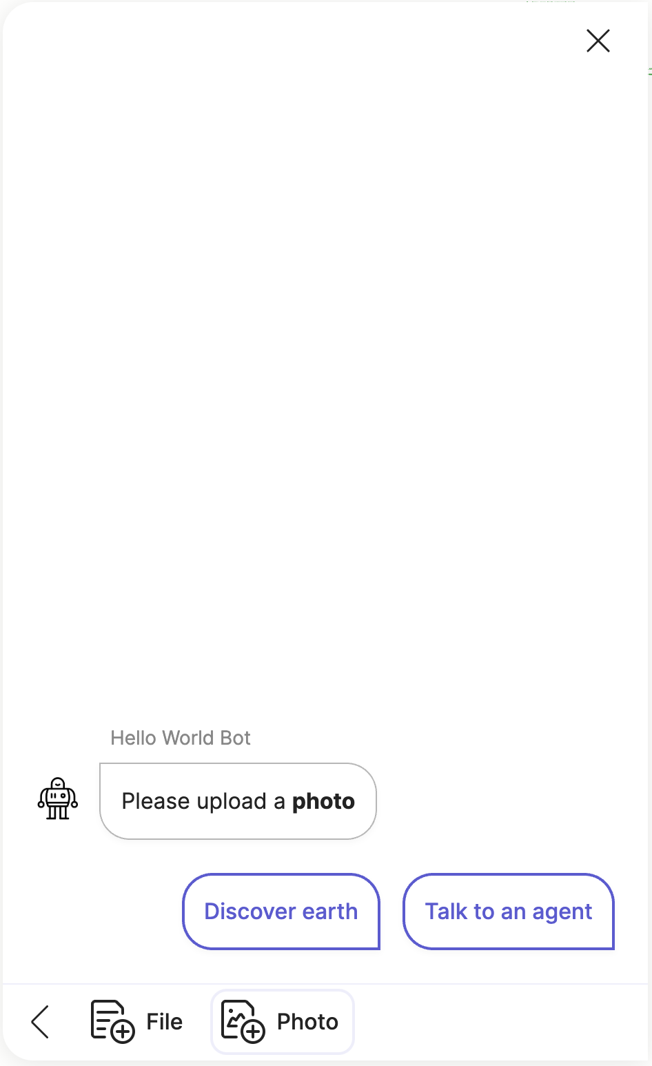
- ask: Please upload a **photo**
  expect: image
  quick_replies:
    - text: Discover earth
      action:
        flow: flow.earth
    - text: Talk to an agent
      action:
        flow: flow.agent
  context:
    foo: bar
  composer:
    focus: image
  markdown:
    - format
    - linkify
Which produces the following output:
Note, not all integrations support the quick_replies, composer and markdown
fields. Check the compatibility matrix
and integration documentation to see which features the specific integration
you are using supports.
Input validation
The ask image component does not do any file type or extension checking on the
uploaded file. All it expects is a valid image
event. The image event will be created by the specific integration that
the user is using e.g. Orb, WhatsApp etc. and each integration will do some
basic file type and/or MIME type checking before it creates and publishes
the image event.
Element details
type: meya.image.component.ask
class: ImageAskComponent
path: /meya/image/component/ask/ask.py
signature: ask, expect
Fields
| field | description | required | signature | default | type |
|---|---|---|---|---|---|
| spec | Override the original spec for this element. | ○ | ○ | null | Spec |
| context | Send context data with this component's event. | ○ | ○ | {} | dict |
| sensitive | Mark this component's event as sensitive. This will encrypt the event if the Sensitive Data integration has been enabled. | ○ | ○ | false | bool |
| triggers | Activate these dynamic triggers when the component runs. Check the component triggers guide for more info. | ○ | ○ | [] | list |
| quick_replies | List of buttons that the user can select for replies. | ○ | ○ | [] | list |
| composer | The composer spec that allows you to control the Orb's input composer. Check the Composer guide for more info. | ○ | ○ | focus: image placeholder: collapse_placeholder: visibility: show character_limit: | ComposerElementSpec |
| header | Override the header for this component. | ○ | ○ | buttons: title: progress: milestones: extra_buttons: | HeaderElementSpec |
| markdown | Override the bot Markdown mode for this component. Check the Markdown guide for more info. | ○ | ○ | null | list bool NoneType |
| ask | Question to send to the user. | ○ | ◉ | str | |
| expect | The type of input to expect, image. | ○ | ◉ | null | Expect |
Usage reference
Basic
triggers:
  - keyword: meya.image.component.ask
steps:
  - ask: STRING
    expect: image
Full
triggers:
  - keyword: meya.image.component.ask
steps:
  - spec:
      type: STRING
      data:
        STRING: ANY
      timeout: 123
      trigger_when: ANY
    context:
      STRING: ANY
    sensitive: false
    triggers:
      - type: STRING
        data:
          STRING: ANY
        timeout: 123
        trigger_when: ANY
    quick_replies:
      - url: STRING
        javascript: STRING
        button_id: STRING
        context:
          STRING: ANY
        default: false
        disabled: false
        divider: false
        icon:
          url: STRING
          color: STRING
          path: STRING
        action: COMPONENT
        value: ANY
        result: ANY
        data:
          STRING: ANY
        magic: false
        type: text|url|static|menu|divider|action|flow_next|component_next
        menu:
          - BUTTONELEMENTSPEC
        text: STRING
    composer:
      focus: file|image|text|blur
      placeholder: STRING
      collapse_placeholder: STRING
      visibility: collapse|hide|show
      character_limit:
        length: 123
        error_text: STRING
    header:
      buttons:
        - url: STRING
          javascript: STRING
          button_id: STRING
          context:
            STRING: ANY
          default: false
          disabled: false
          divider: false
          icon:
            url: STRING
            color: STRING
            path: STRING
          action: COMPONENT
          value: ANY
          result: ANY
          data:
            STRING: ANY
          magic: false
          type: text|url|static|menu|divider|action|flow_next|component_next
          menu:
            - BUTTONELEMENTSPEC
          text: STRING
      title:
        text: STRING
        icon:
          url: STRING
          color: STRING
          path: STRING
      progress:
        value: 123
        show_percent: false
      milestones:
        - text: STRING
          current: false
      extra_buttons:
        - url: STRING
          javascript: STRING
          button_id: STRING
          context:
            STRING: ANY
          default: false
          disabled: false
          divider: false
          icon:
            url: STRING
            color: STRING
            path: STRING
          action: COMPONENT
          value: ANY
          result: ANY
          data:
            STRING: ANY
          magic: false
          type: text|url|static|menu|divider|action|flow_next|component_next
          menu:
            - BUTTONELEMENTSPEC
          text: STRING
    markdown:
      - format|linkify|breaks|typographer
    ask: STRING
    expect: image