
Send text to the user. This is the most used and simplest output component
in the Meya SDK. It simply takes a text string and creates a text.say
event that then gets displayed to the user.
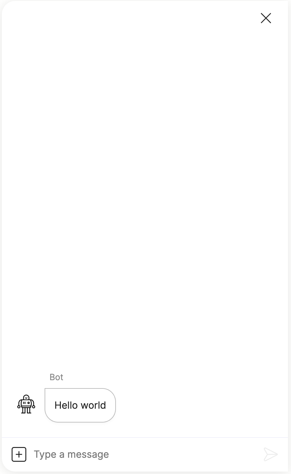
- say: Hello world!Which produces the following in the Meya Orb Web SDK client:
Although the say component is very simple to use, it is also an interactive
component which allows you to set quick replies, configure the
input composer, configure the markdown support, set context data and attach
component triggers.
Here is a more advanced example:
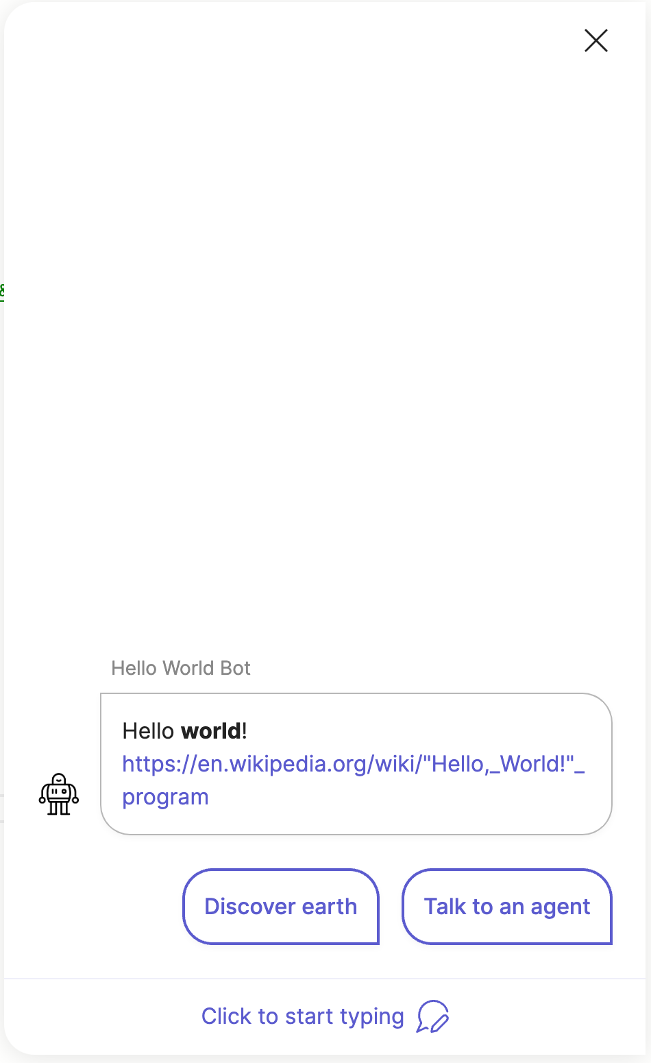
- say: Hello **world**! https://en.wikipedia.org/wiki/%22Hello,_World!%22_program
  quick_replies:
    - text: Discover earth
      action:
        flow: flow.earth
    - text: Talk to an agent
      action:
        flow: flow.agent
  context:
    foo: bar
  composer:
    focus: blur
    visibility: collapse
    collapse_placeholder: Click to start typing
  markdown:
    - format
    - linkify
Which produces the following output:
Note, not all integrations support the quick_replies, composer and markdown
fields. Check the compatibility matrix
and integration documentation to see which features the specific integration
you are using supports.
Advanced use-case
You can even use component triggers to allow the say component to wait
and capture user input, which effectively turns this into an input component.
- say: What's your name?
  triggers:
    - catchall
Because of the catchall trigger, the bot will wait for user input and store
the value in (@ flow.result ). Check the component triggers guide
for more info.
Element details
type: meya.text.component.say
class: SayComponent
path: /meya/text/component/say/say.py
signature: say
Fields
| field | description | required | signature | default | type |
|---|---|---|---|---|---|
| spec | Override the original spec for this element. | ○ | ○ | null | Spec |
| context | Send context data with this component's event. | ○ | ○ | {} | dict |
| sensitive | Mark this component's event as sensitive. This will encrypt the event if the Sensitive Data integration has been enabled. | ○ | ○ | false | bool |
| triggers | Activate these dynamic triggers when the component runs. Check the component triggers guide for more info. | ○ | ○ | [] | list |
| quick_replies | List of buttons that the user can select for replies. | ○ | ○ | [] | list |
| composer | Override the Orb composer for this component. | ○ | ○ | focus: placeholder: collapse_placeholder: visibility: character_limit: | ComposerElementSpec |
| header | Override the header for this component. | ○ | ○ | buttons: title: progress: milestones: extra_buttons: | HeaderElementSpec |
| markdown | Override the bot Markdown mode for this component. Check the Markdown guide for more info. | ○ | ○ | null | list bool NoneType |
| say | Text to send to the user. | ○ | ◉ | str | |
Usage reference
Basic
triggers:
  - keyword: meya.text.component.say
steps:
  - say: STRING
Full
triggers:
  - keyword: meya.text.component.say
steps:
  - spec:
      type: STRING
      data:
        STRING: ANY
      timeout: 123
      trigger_when: ANY
    context:
      STRING: ANY
    sensitive: false
    triggers:
      - type: STRING
        data:
          STRING: ANY
        timeout: 123
        trigger_when: ANY
    quick_replies:
      - url: STRING
        javascript: STRING
        button_id: STRING
        context:
          STRING: ANY
        default: false
        disabled: false
        divider: false
        icon:
          url: STRING
          color: STRING
          path: STRING
        action: COMPONENT
        value: ANY
        result: ANY
        data:
          STRING: ANY
        magic: false
        type: text|url|static|menu|divider|action|flow_next|component_next
        menu:
          - BUTTONELEMENTSPEC
        text: STRING
    composer:
      focus: file|image|text|blur
      placeholder: STRING
      collapse_placeholder: STRING
      visibility: collapse|hide|show
      character_limit:
        length: 123
        error_text: STRING
    header:
      buttons:
        - url: STRING
          javascript: STRING
          button_id: STRING
          context:
            STRING: ANY
          default: false
          disabled: false
          divider: false
          icon:
            url: STRING
            color: STRING
            path: STRING
          action: COMPONENT
          value: ANY
          result: ANY
          data:
            STRING: ANY
          magic: false
          type: text|url|static|menu|divider|action|flow_next|component_next
          menu:
            - BUTTONELEMENTSPEC
          text: STRING
      title:
        text: STRING
        icon:
          url: STRING
          color: STRING
          path: STRING
      progress:
        value: 123
        show_percent: false
      milestones:
        - text: STRING
          current: false
      extra_buttons:
        - url: STRING
          javascript: STRING
          button_id: STRING
          context:
            STRING: ANY
          default: false
          disabled: false
          divider: false
          icon:
            url: STRING
            color: STRING
            path: STRING
          action: COMPONENT
          value: ANY
          result: ANY
          data:
            STRING: ANY
          magic: false
          type: text|url|static|menu|divider|action|flow_next|component_next
          menu:
            - BUTTONELEMENTSPEC
          text: STRING
    markdown:
      - format|linkify|breaks|typographer
    say: STRING