
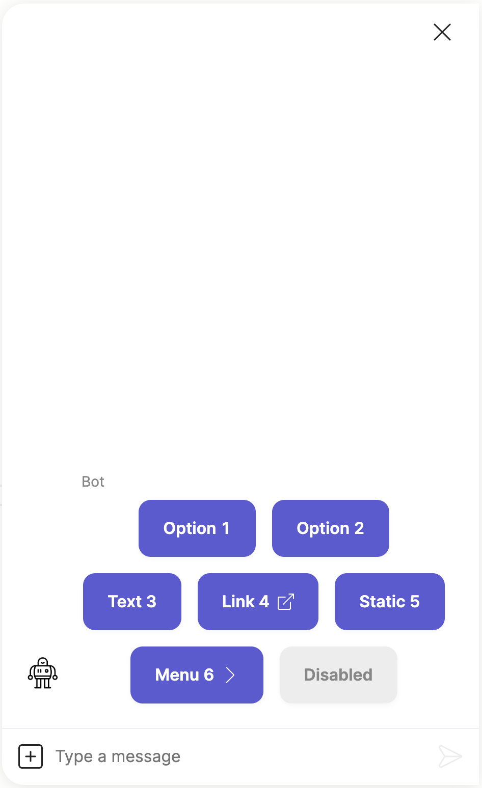
Show a set of buttons for the user to select.
- buttons:
  - text: Option 1
    result:
      key: 1
  - text: Option 2
    result:
      - two
      - two
  - text: Text 3
  - text: Link 4
    url: https://example.org/?n=5
  - text: Static 5
    button_id: _static_button
    context:
      product: marmalade
  - text: Menu 6
    menu:
      - text: Result 10
        result: 10
      - text: Result 11
        result: 11
      - text: Result 20
        result: 20
  - text: Disabled
    disabled: true
Which produces the following in the Meya Orb Web SDK client:
The ask buttons components is also an interactive component which allows you to set quick replies, configure the
input composer, configure the markdown support, set context data and attach
component triggers.
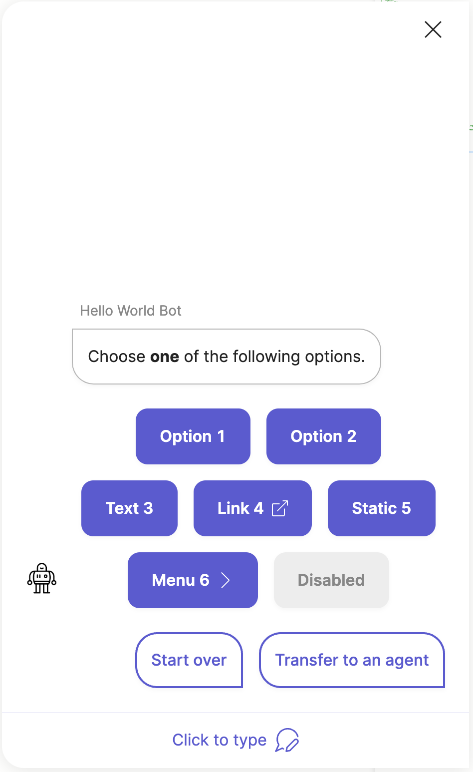
Here is another example including some interactive component features:
- ask: Choose **one** of the following options.
  buttons:
  - text: Option 1
    result:
      key: 1
  - text: Option 2
    result:
      - two
      - two
  - text: Text 3
  - text: Link 4
    url: https://example.org/?n=5
  - text: Static 5
    button_id: _static_button
    context:
      product: marmalade
  - text: Menu 6
    menu:
      - text: Result 10
        result: 10
      - text: Result 11
        result: 11
      - text: Result 20
        result: 20
  - text: Disabled
    disabled: true
  quick_replies:
    - Start over
    - text: Transfer to an agent
      action: next
  composer:
    visibility: collapse
    collapse_placeholder: Click to type
Which produces the following output:
Note, not all integrations support the quick_replies, composer and markdown
fields. Check the compatibility matrix
and integration documentation to see which features the specific integration
you are using supports.
Button spec
Each item in the buttons field must contain a valid button spec that
specifies how the button should look and work. This button spec maps to
the ButtonElementSpec Python class which is used by both buttons and
quick replies.
This makes quick replies very similar to buttons, but where they differ is
that a quick reply can be configured to reply as a text.say event instead of
a button.click
event, whereas buttons can only create button.click
events.
Check the Buttons & Quick Replies guide for more detail.
Pages support
The ask buttons component is also a widget component that can be displayed as a field
in a page.
Here is an example using the ask buttons component in a page:
- page:
  - buttons:
    - text: Option 1
      result:
        key: 1
    - text: Option 2
      result:
        - two
        - two
    - text: Text 3
    - text: Link 4
      url: https://example.org/?n=5
    - text: Static 5
      button_id: _static_button
      context:
        product: marmalade
    - text: Menu 6
      menu:
        - text: Result 10
          result: 10
        - text: Result 11
          result: 11
        - text: Result 20
          result: 20
    - text: Disabled
      disabled: true
Which produces the following output:
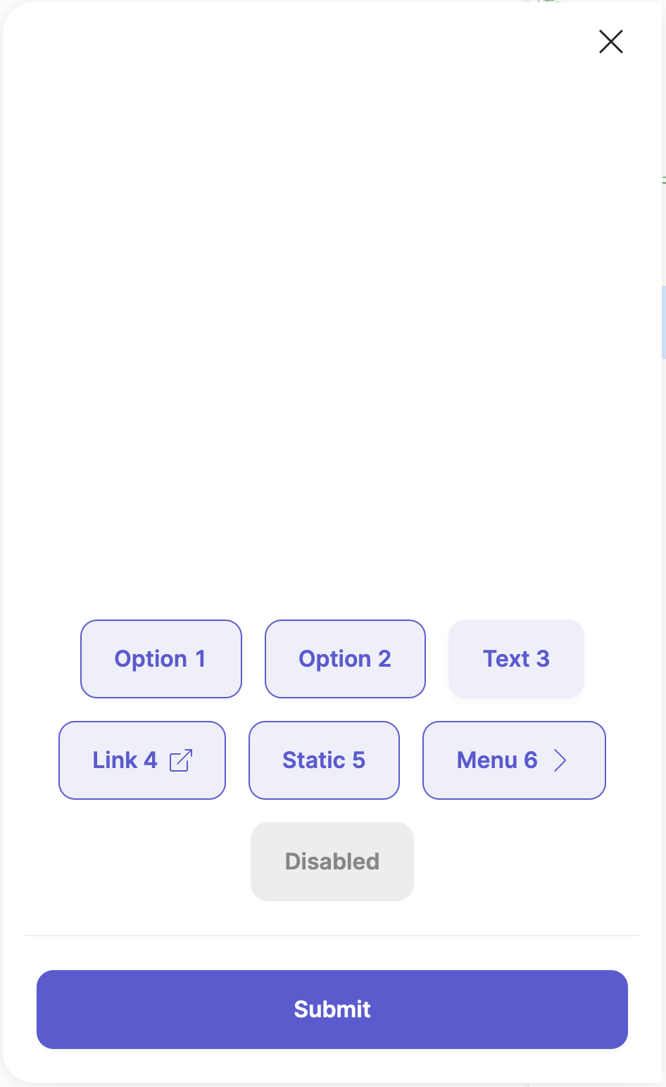
Check the Widgets & Pages guide for more info on creating advanced
form wizards for collecting user input.
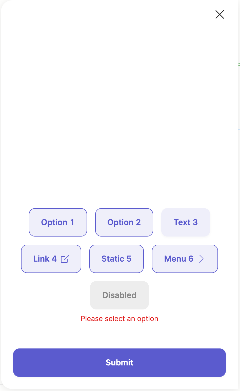
Input validation
The buttons component can be marked as required, and when the required
fields is set to true then the component will display an error if the
user does not select a button. This is only applicable when using the
buttons component in a page.
Here is an example of the error:
Element details
type: meya.button.component.ask
class: ButtonAskComponent
path: /meya/button/component/ask.py
signature: buttons
Fields
| field | description | required | signature | default | type |
|---|---|---|---|---|---|
| spec | Override the original spec for this element. | ○ | ○ | null | Spec |
| context | Send context data with this component's event. | ○ | ○ | {} | dict |
| sensitive | Mark this component's event as sensitive. This will encrypt the event if the Sensitive Data integration has been enabled. | ○ | ○ | false | bool |
| triggers | Activate these dynamic triggers when the component runs. Check the component triggers guide for more info. | ○ | ○ | [] | list |
| quick_replies | List of buttons that the user can select for replies. | ○ | ○ | [] | list |
| composer | The composer spec that allows you to control the Orb's input composer. Check the Composer guide for more info. | ○ | ○ | focus: blur placeholder: collapse_placeholder: visibility: character_limit: | ComposerElementSpec |
| header | Override the header for this component. | ○ | ○ | buttons: title: progress: milestones: extra_buttons: | HeaderElementSpec |
| markdown | Override the bot Markdown mode for this component. Check the Markdown guide for more info. | ○ | ○ | null | list bool NoneType |
| ask | Question to send to the user. | ○ | ○ | null | str |
| buttons | List of buttons that the user can select. Check the button spec guide for more info on the different fields. | ◉ | ◉ | list | |
| multi | Whether multiple buttons can be selected at a time. This is similar to how a typical checkbox behaves. | ○ | ○ | false | bool |
| label | The label displayed above the set of buttons. | ○ | ○ | null | str |
| required | Specifies whether one of the buttons must be selected or not. | ○ | ○ | false | bool |
| error_message | The error message that is displayed when the a selection is required. | ○ | ○ | "Please select an option" | str |
Usage reference
Basic
triggers:
  - keyword: meya.button.component.ask
steps:
  - buttons:
      - value: ANY
        result: ANY
Full
triggers:
  - keyword: meya.button.component.ask
steps:
  - spec:
      type: STRING
      data:
        STRING: ANY
      timeout: 123
      trigger_when: ANY
    context:
      STRING: ANY
    sensitive: false
    triggers:
      - type: STRING
        data:
          STRING: ANY
        timeout: 123
        trigger_when: ANY
    quick_replies:
      - url: STRING
        javascript: STRING
        button_id: STRING
        context:
          STRING: ANY
        default: false
        disabled: false
        divider: false
        icon:
          url: STRING
          color: STRING
          path: STRING
        action: COMPONENT
        value: ANY
        result: ANY
        data:
          STRING: ANY
        magic: false
        type: text|url|static|menu|divider|action|flow_next|component_next
        menu:
          - BUTTONELEMENTSPEC
        text: STRING
    composer:
      focus: file|image|text|blur
      placeholder: STRING
      collapse_placeholder: STRING
      visibility: collapse|hide|show
      character_limit:
        length: 123
        error_text: STRING
    header:
      buttons:
        - url: STRING
          javascript: STRING
          button_id: STRING
          context:
            STRING: ANY
          default: false
          disabled: false
          divider: false
          icon:
            url: STRING
            color: STRING
            path: STRING
          action: COMPONENT
          value: ANY
          result: ANY
          data:
            STRING: ANY
          magic: false
          type: text|url|static|menu|divider|action|flow_next|component_next
          menu:
            - BUTTONELEMENTSPEC
          text: STRING
      title:
        text: STRING
        icon:
          url: STRING
          color: STRING
          path: STRING
      progress:
        value: 123
        show_percent: false
      milestones:
        - text: STRING
          current: false
      extra_buttons:
        - url: STRING
          javascript: STRING
          button_id: STRING
          context:
            STRING: ANY
          default: false
          disabled: false
          divider: false
          icon:
            url: STRING
            color: STRING
            path: STRING
          action: COMPONENT
          value: ANY
          result: ANY
          data:
            STRING: ANY
          magic: false
          type: text|url|static|menu|divider|action|flow_next|component_next
          menu:
            - BUTTONELEMENTSPEC
          text: STRING
    markdown:
      - format|linkify|breaks|typographer
    ask: STRING
    buttons:
      - url: STRING
        javascript: STRING
        button_id: STRING
        context:
          STRING: ANY
        default: false
        disabled: false
        divider: false
        icon:
          url: STRING
          color: STRING
          path: STRING
        action: COMPONENT
        value: ANY
        result: ANY
        data:
          STRING: ANY
        magic: false
        type: text|url|static|menu|divider|action|flow_next|component_next
        menu:
          - BUTTONELEMENTSPEC
        text: STRING
    multi: false
    label: STRING
    required: false
    error_message: STRING